
Small experiment (which turned in to tutorial) on how straightforward it would be to write React accessible accordion component. I have no prior experience in accessibility (well, maybe some basic things, like use alt param don't use links as buttons).
I followed Accordion Design Pattern in WAI-ARIA Authoring Practices 1.1 and nothing else.
The focus of this tutorial is a11y and React, so we will not care about how to pack to npm or CSS-in-JS or anything else. The easiest way to start in this case is with create-react-app.
Bootstrap
Let's bootstrap our project
npx create-react-app my-app
cd my-app
npm start
Design API
It's time to think about the API of the component. Let's take a look at typical accordion:
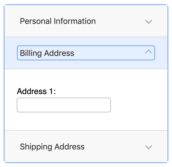
There are a root component and sections. Each section has a title and content. Right? Based on this we can imagine how our API will look like:
const App = () => (
  <Accordion>
    <AccordionSection title="section 1">content 1</AccordionSection>
    <AccordionSection title="section 2" expanded>
      content 2
    </AccordionSection>
  </Accordion>
);
Let's write first draft of the components for given API
import React from "react";

export const Accordion = ({ children }) => <div>{children}</div>;

export const AccordionSection = ({ children, title, expanded }) => (
  <>
    <div>{title}</div>
    <div>{expanded && children}</div>
  </>
);
Add a11y
Nice. Let's open Accordion Design Pattern in WAI-ARIA Authoring Practices 1.1 and copy-paste all required markup:
export const AccordionSection = ({ children, title, expanded, id }) => {
  const sectionId = `section-${id}`;
  const labelId = `label-${id}`;

  return (
    <>
      <div
        role="button"
        aria-expanded={expanded}
        aria-controls={sectionId}
        id={labelId}
        tabIndex={0}
      >
        {title}
      </div>
      <div
        role="region"
        aria-labelledby={labelId}
        id={sectionId}
        hidden={!expanded}
      >
        {expanded && children}
      </div>
    </>
  );
};
Accordion doesn't need to change. There are two elements: Header and Panel. Header (role="button") has id and aria-controls (id of corresponding Panel). Panel (role="region") has id and aria-labelledby (id of corresponding Header). aria-expanded if the section is expanded or not. hidden opposite of if the section is expanded or not. Pretty straightforward IMO.

Now it's time to add state and event handling.
State and callback (we are creating controlled component):
function App() {
  const [expanded1, setExpanded1] = useState(false);
  return (
      <Accordion>
        <AccordionSection
      ...
          expanded={expanded1}
          onToggle={() => setExpanded1(!expanded1)}
        >
Event handling
export const AccordionSection = ({
  ...
  expanded,
  onToggle
}) => {
  ...
  return (
    <>
      <div
        role="button"
        ...
        onClick={onToggle}
        onKeyDown={e => {
          switch (e.key) {
            case " ":
            case "Enter":
              onToggle();
              break;
            default:
          }
        }}
      >
Let's pause
At this point, it is already a pretty good result. We fulfill half of the requirements for a11y, with not so much of work.
-
Space or Enter
- When focus is on the accordion header of a collapsed section, expands the section.
-
Tab
- Moves focus to the next focusable element.
- All focusable elements in the accordion are included in the page Tab sequence.
-
Shift + Tab
- Moves focus to the previous focusable element.
- All focusable elements in the accordion are included in the page Tab sequence.
If you do at least this, it would be already better than nothing.
More a11y
Next section is a bit more complicated (more fun).
-
Down Arrow
- When focus is on an accordion header, moves focus to the next accordion header.
- When focus is on last accordion header, moves focus to first accordion header.
-
Up Arrow
- When focus is on an accordion header, moves focus to the previous accordion header.
- When focus is on first accordion header, moves focus to last accordion header.
To do this we need to track where is the focus, to be able to select next or previous section. We need to store this as variable once per each accordion. So maybe useState? Well, but we don't want to trigger re-render of the component when focus changes. Then useRef I guess.
export const Accordion = ({ children }) => {
  const focusRef = useRef(null);
focusRef will contain either id of a currently focused section or null in case none is selected. We need to track focus and blur events on Headers.
<div
  role="button"
  ...
  onFocus={() => {
    focusRef.current = id;
  }}
  onBlur={() => {
    focusRef.current = null;
  }}
So how do we pass focusRef from Accordion down to AccordionSection? We can do this via props (with React.Childre.map and React.CloneElement) or we can do this with Context. I like Context idea more because it creates more clean API.
Create context:
const AccordionContext = createContext({
  focusRef: {}
});
export const useAccordionContext = () => useContext(AccordionContext);
Pass focusRef to Context (I use useMemo to make sure we don't trigger unwanted rerenders due to updates in Context)
const context = useMemo(
  () => ({
    focusRef
  }),
  []
);

return (
  <AccordionContext.Provider value={context}>
    {children}
  </AccordionContext.Provider>
);
And in AccordionSection
const { focusRef } = useAccordionContext();
Ok, this way we can capture currently selected section. Now we need to respond to keyboard events, let's add a handler in the root component:
export const AccordionSection = ({}) => {
  ...
  return (
    <div
      onKeyDown={e => {
        switch (e.key) {
          case "ArrowDown":
            break;
          case "ArrowUp":
            break;
          case "Home":
            break;
          case "End":
            break;
        }
      }}
    >
      <AccordionContext.Provider value={context}>
In the case of ArrowDown we need to find the focus element in children and select the next one. We can get an array of all ids of children element
const ids = React.Children.map(children, child => child.props.id);
then find an index of the focused element
const index = ids.findIndex(x => x === focusRef.current);
then find next value
if (index >= ids.length - 1) {
  return ids[0];
} else {
  return ids[index + 1];
}
Good. But how we will actually trigger a change of focus? 🤔
We can use focus() method for this. To get a DOM Element we will need to use reference.
export const AccordionSection = ({}) => {
  const labelRef = useRef();
  ...
  return (
    <>
      <div
        role="button"
        ...
        ref={labelRef}
      >
As well we will need to use useEffect to actually call a method on a DOM Element. The question is when to trigger this effect? We need to trigger it every time selection of the tab changes, every time the user triggers ArrowDown or ArrowUp etc. So we need to store it in some variable and trigger effect every time it changes
export const AccordionSection = ({}) => {
  ...
  useEffect(() => {
    if (id === selected && labelRef.current) {
      labelRef.current.focus();
    }
  }, [id, selected]);
every time selection changes and the selected item is the same as the current one put the focus on it.
Where do we store selected value? In the root, because we need one variable per Accordion. How do we pass it? Through Context, the same way as we passed focusRef. In Accordion:
const focusRef = useRef(null);
const [selected, setSelected] = useState(null);
const context = useMemo(
  () => ({
    focusRef,
    selected
  }),
  [selected]
);
...
case "ArrowDown":
  {
    const ids = React.Children.map(children, child => child.props.id);
    const index = ids.findIndex(x => x === focusRef.current);
    if (index >= ids.length - 1) {
      setSelected(ids[0]);
    } else {
      setSelected(ids[index + 1]);
    }
  }
and in AccordionSection:
const { focusRef, selected } = useAccordionContext();
Phew! We made it. Fully accessible component. Don't forget to add logic for
- Home
- When focus is on an accordion header, moves focus to the first accordion header.
- End
- When focus is on an accordion header, moves focus to the last accordion header.
Developer Experience
We took care of users let's take care of developers. We heavily rely on ids, in case the developer will forget to provide it they will get very subtle errors. Let's check if it is present and warn otherwise:
AccordionSection.propTypes = {
  id: PropTypes.oneOfType([PropTypes.string, PropTypes.number]).isRequired,
  title: PropTypes.string.isRequired,
  expanded: PropTypes.bool,
  onToggle: PropTypes.func
};
As well we assume that ids are unique, let's check it too:
if (process.env.NODE_ENV === "development") {
  const uniqueIds = new Set();
  React.Children.forEach(children, child => {
    if (uniqueIds.has(child.props.id)) {
      console.warn(
        `AccordionSection id param should be unique, found the duplicate key: ${
          child.props.id
        }`
      );
    } else {
      uniqueIds.add(child.props.id);
    }
  });
}
As of now, API of our component requires onToggle callback which supposes to be bound to its id or be unique for each section. This API is hard to use. Let's instead pass id to callback. This way developer can use one store and one callback for all sections:
const [expanded, setExpanded] = useState({ "2": true });
const toggle = id => {
  setExpanded({
    ...expanded,
    [id]: !expanded[id]
  });
};
...
<AccordionSection
  title="section 1"
  id="1"
  expanded={expanded["1"]}
  onToggle={toggle}
>
...
<AccordionSection
  title="section 2"
  id="2"
  expanded={expanded["2"]}
  onToggle={toggle}
I don't like that we need to repeat expanded and onToggle for each section, instead, we can pass it once to Accordion:
<Accordion expanded={expanded} onToggle={onToggle}>
  <AccordionSection title="section 1" id="id1">
  ...
  </AccordionSection>
  <AccordionSection title="section 2" id="id2">
  ...
  </AccordionSection>
</Accordion>
It looks cleaner this way. As well there are some drawbacks like you need to make sure that ids in state and ids in AccordionSections are the same (otherwise some section may not work).
We can go even further and provide a custom hook for default behavior.
import { useState } from "react";

export const useAccordionState = intialState => {
  const [expanded, setExpanded] = useState(intialState);
  const onToggle = id => {
    setExpanded({
      ...expanded,
      [id]: !expanded[id]
    });
  };
  return { expanded, onToggle };
};
So the final code will look like this:
function App() {
  const accordionProps = useAccordionState({ });
  return (
      <Accordion {...accordionProps}>
        <AccordionSection title="section 1" id="id1">
Conclusion
It wasn't that scary as I thought. WAI-ARIA Authoring Practices are well written 👏. I encourage you to use appropriate markup and keyboard events (every time you use onClick). Implementing fully accessible components can be a fun learning exercise.
Online demo is here. Full source code is here.
PS
If I won't be lazy and if this post will have an interest I will write about how to test this component with Cypress and how to fix one sneaky bug that I noticed after I wrote the post.


Top comments (0)