How to Use a Vue Scatter or Bubble Chart UI Component in Your Web App

Scatter charts and bubble charts can help you visualize whether a relationship exists between several variables. See how you can easily incorporate them into your Vue apps.
In my last post on this topic, we talked about using a Vue Bar Chart with Kendo UI. In this post, we will learn how to use the scatter and the bubble chart.
Scatter charts are used to determine whether a relationship exists between two variables. The strength of the relationship is determined by how closely the data points fit a line. The direction of the line determines if there is a positive relationship, negative relationship or no relationship between the variables. Bubble charts are similar to scatter charts except you can compare up to four variables. The size and the color of the bubble represent two additional variables.
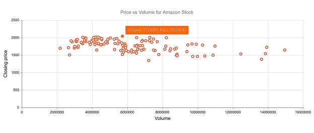
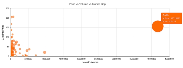
Coming up, we will create a scatter chart to plot the price and volume for Amazon stock. Then, we will create a bubble chart to plot the price, volume, and market cap for a group of stocks.
Getting Started
We will first initialize a Vue project using the webpack-simple template. Next, we will install our dependencies. We will need to install Kendo UI, a theme, the Charts package, and the DataSource package. The following commands install all of our packages.
npm install --save @progress/kendo-ui
npm install --save @progress/kendo-theme-default
npm install --save @progress/kendo-charts-vue-wrapper
npm install --save @progress/kendo-datasource-vue-wrapper
Inside the main.js file, we import the packages. We register the Chart and DataSource globally using the ChartInstaller and DataSourceInstaller then add them to the component list.
import Vue from 'vue'
import App from './App.vue'
import '@progress/kendo-ui'
import '@progress/kendo-theme-default/dist/all.css'
import { Chart, ChartInstaller } from '@progress/kendo-charts-vue-wrapper'
import { DataSource, DataSourceInstaller } from '@progress/kendo-datasource-vue-wrapper'

Vue.use(ChartInstaller)
Vue.use(DataSourceInstaller)

new Vue({
  el: '#app',
  components: {
  	Chart,
  	DataSource
  },
  render: h => h(App)
})
Creating a Scatter Chart
We want to see if there is a relationship between price and volume for our stock. If prices rise as the volume rises, the data should form an upward sloping band. This could be a good sign the prices are on an upward trend. Inside the template in our App.vue file we will remove the markup between the #app element and add a DataSource and Chart component. The DataSource component requires a name so we can reference it in our chart component, the URL of our web service, and the response data type. The following is the URL for our request:
https://api.iextrading.com/1.0/stock/amzn/chart/6m
The API we are using is provided by IEX. This endpoint will return the last six months of stock data for Amazon. Here is what an example response looks like:
[
    {
        "date": "2018-07-02",
        "open": 1682.7,
        "high": 1713.89,
        "low": 1678.06,
        "close": 1713.78,
        "volume": 3185696,
        "unadjustedVolume": 3185696,
        "change": 13.98,
        "changePercent": 0.822,
        "vwap": 1699.05,
        "label": "Jul 2, 18",
        "changeOverTime": 0
    },
    …
]
The Chart component will include a reference to the data source, a title, a tooltip, a series, an x-axis, and a y-axis. The value of these attributes will be set in the component’s data. This is the updated template with the DataSource and Chart components added:
<template>
  <div id="app">
     <kendo-datasource
      ref="dataSource"
      :transport-read-url="'https://api.iextrading.com/1.0/stock/amzn/chart/6m'"
      :transport-read-data-type="'json'">
    </kendo-datasource>
    <kendo-chart
      :data-source-ref="'dataSource'"
      :title="title"
      :tooltip="tooltip"
      :series="series"
      :x-axis="xAxis"
      :y-axis="yAxis">
    </kendo-chart>
  </div>
</template>
In the script portion of the component, we will add the text for the title. We will make the tooltip visible and give it a template. For the series, we will specify the type and set the x field and y field. Then for the x-axis and y-axis, we will set the text for the title. Here is the updated script:
<script>
export default {
  name: 'app',
  data () {
    return {
      title: {
        text: 'Price vs Volume for Amazon Stock'
      },
      tooltip: {
        visible: true,
        template: 'Volume: #: value.x #, Price: $#: value.y #'
      },
      series: [{
        type: 'scatter',
        xField: 'volume',
        yField: 'close'
      }],
      xAxis: {
        title: {
          text: 'Volume'
        }
      },
      yAxis: {
        title: {
          text: 'Closing price'
        }
      }
    }
  }
}
</script>

This is a link to the project’s repo: https://github.com/albertaw/kendoui-scatterchart
Creating a Bubble Chart
We want to show the relationship between volume, price, and market cap on our bubble chart. We will be looking at a group of stocks in the computer hardware sector. Volume will be our x variable. Price will be the y variable. And the market cap will be the size of the bubble. We might predict that stocks with the highest volume will also have the highest price. If this is the case we expect to see the points form a line that has an upward slope. Or, we could find that stocks with a larger market cap have a higher price. In this case, larger bubbles will be higher up on the graph. This may not be the case however and there is also the possibility that no relationship exists between the variables.
The components for the bubble chart will remain the same nearly the same. This is the URL that the data source will use:
https://api.iextrading.com/1.0/stock/market/collection/tag?collectionName=Computer+Hardware
The title and tooltip will also change. The series type is changed to bubble. In addition to an x and y field, a size and category field are added to the series. The category field represents the individual stocks, therefore, we will use the stock symbol for this entry. This is the updated script:
<script>
export default {
  name: 'app',
  data () {
    return {
      title: {
        text: 'Price vs Volume vs Market Cap'
      },
      tooltip: {
        visible: true,
        template: '<strong>#: category #</strong> Volume: #: value.x # <br> Price: $#: value.y #'
      },
     series: [{
      type: 'bubble',
      xField: 'latestVolume',
      yField: 'close',
      sizeField: 'marketCap',
      categoryField: 'symbol'
     }],
     xAxis: {
      title: {
        text: 'Latest Volume'
      }
     },
     yAxis: {
      title: {
        text: 'Closing Price'
      }
     }
    }
  }
}
</script>

This is the link to the repo for this example: https://github.com/albertaw/kendoui-bubblechart
Summary
Scatter charts and bubble charts are used to see how data is related. A trend line shows if there is a relationship between the variables, how strong the relationship is, and the direction of the relationship. We created a scatter chart for Amazon stock to see the relationship between price and volume. Then we created a bubble chart to see if there was a relationship between volume, price and market cap for stocks in the computer hardware sector. We only saw the basics of what can be configured with the charts. There is another variation of the scatter chart, the scatter line chart which connects all of the points. The scatter and bubble charts can also be bound to grouped data.
In the next post, you will see how to create a pie and donut chart. Both of these charts visualize data that has a part-whole relationship.
Resources
- Scatter Chart Repo
- Bubble Chart Repo
- Vue Webpack-Simple Template
- IEX API
- DataSource Overview
- Charts Overview
- Kendo UI Vue Docs and Demos
- Vue.js Webpack-Simple Template
Try Out Kendo UI for Yourself
Want to start taking advantage of the more than 70+ ready-made Kendo UI components, like the Grid or Scheduler? You can begin a free trial of Kendo UI for Vue today and start developing your apps faster.
Angular, React, and jQuery Versions
Looking for UI component to support specific frameworks? Check out Kendo UI for Angular, Kendo UI for React, or Kendo UI for jQuery.

Alberta Williams
Alberta is a software developer and writer from New Orleans. Learn more about Alberta at github.com/albertaw.
