Reconsidering "text-overflow: ellipsis" As A Design Smell And Accessibility Concern
When I first came across the CSS property, text-overflow: ellipsis, I thought it was amazing! Finally, there was a clean and easy way to prevent a user's content from "breaking the design." This mindset took root in the "pixel perfect" design requirements handed-down from the days of yore. And, it has somehow stood the test of time. But, after reading Accessibility For Everyone by Laura Kalbag, I am suddenly reconsidering the use of text-overflow. Whereas it once felt elegant, it now feels like a "Design Smell" - an indication that something in the design is based on incorrect principles or priorities.
In my review of "Accessibility For Everyone", I stated that the book was, in many ways, a "manifesto on building empathy" with the User. When primed with this perspective, the CSS property, text-overflow: ellipsis, feels misguided. It isn't there to facilitate empathy with the User - it's there to facilitate empathy with the Designer; it's there to ensure that nothing breaks the "aesthetic of the design," even at the cost of clarity.
Take, for example, the "name" of each screen in this thumbnail-based screen list:
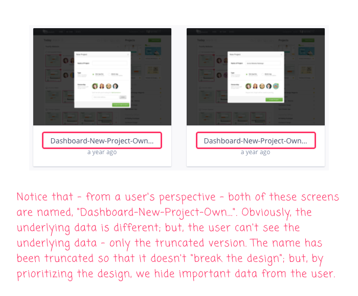
Notice that, from a user's perspective, both of these screens read as, Dashboard-New-Project-Own.... In this case, we are truncating the unique-name of the screen because the "design" can't afford to wrap the name onto two lines. We are using text-overflow: ellipsis to prevent the user's open-ended content from breaking the close-ended constraints imposed by the design aesthetic.
Now, I am not saying that text-overflow: ellipsis is always wrong. Nor do I have a great way to fix the example above. But, I am saying that when we explicitly place the design aesthetic above all else, we are implicitly demoting clarity and accessibility as a secondary concern. Sometimes this trade-off makes sense.
But, perhaps most of the time, it doesn't.
Going forward, when I create or implement an application interface, instead of thinking about how I can bend the user's content to fit the design, I am going to step-back and think about how I might be able to rethink the design in order to better accommodate the user's content. As Laura Kalbag said in her book, "We can be generous with our design". And, I believe that the less we use text-overflow: ellipsis, the more generous and empathetic our thinking will become.
Reader Comments
I think that this CSS feature is appropriate in situations where the text is merely a preview, something that can be considered optional or an enhancement. An example of this is Gmail on desktop, where each line in the list of email messages includes the beginning of the email body, as much as fits onto the line.
In the example you highlighted, the text is a heading or title, so it's not optional and shouldn't be truncated.
It always bugged me when I couldn't see the whole information when ellipsis are displayed. From an accessibility issue, I've always put the full description in "alt" attribute, though I think ellipsis wise it's still there, so the text reader would still get it. I also usually add it to the "title" attribute, which will provide a mouse hover, though not exactly obvious UI wise. Other than that you have to resort to checking the scrollWidth (offsetWidth) of the child against the parent and then alter the view with an expand control or some other UI element.
Good info here https://stackoverflow.com/questions/7738117/html-text-overflow-ellipsis-detection
@Šime,
Yeah, the GMail example is a great example. But, I also don't mean to say that we should just allow all user content to be rendered without constraints. If nothing else, that opens the door for malicious users to try and render content that purposefully breaks the layout (such as submitting a string with 10,000 letters and no spaces). But, where possible we should do our best to show the most meaningful and actionable data.
@Christopher,
Great point - putting the full text in the
titleattribute is, at least, making it available in some respects. Granted, it might only be us web-developers who know that exists :D But, at least it's a step in the right direction.@All,
After posting this, I had a good conversation at work about the way MacOS Finder "center aligns" the ellipsis when there is not enough room to render a folder / file name. I wanted to see if I could achieve something similar using Flexbox:
www.bennadel.com/blog/3626-trying-to-center-a-text-overflow-ellipsis-using-css-flexbox-in-angular-7-2-15.htm
This uses
text-overflow: ellipsis; but, it does so mid-way through the string using an old "sliding door" technique from days of yore.