
In the modern age of technology, increasing amounts of data are produced and collected. In machine learning, however, too much data can be a bad thing. At a certain point, more features or dimensions can decrease a model’s accuracy since there is more data that needs to be generalized — this is known as the curse of dimensionality.
Dimensionality reduction is way to reduce the complexity of a model and avoid overfitting. There are two main categories of dimensionality reduction: feature selection and feature extraction. Via feature selection, we select a subset of the original features, whereas in feature extraction, we derive information from the feature set to construct a new feature subspace.
In this tutorial we will explore feature extraction. In practice, feature extraction is not only used to improve storage space or the computational efficiency of the learning algorithm, but can also improve the predictive performance by reducing the curse of dimensionality—especially if we are working with non-regularized models.
Specifically, we will discuss the Principal Component Analysis (PCA) algorithm used to compress a dataset onto a lower-dimensional feature subspace with the goal of maintaining most of the relevant information. We will explore:
- The concepts and mathematics behind PCA
- How to execute PCA step-by-step from scratch using Python
- How to execute PCA using the Python library
scikit-learn
Let’s get started!
This tutorial is adapted from Part 2 of Next Tech’s Python Machine Learning series, which takes you through machine learning and deep learning algorithms with Python from 0 to 100. It includes an in-browser sandboxed environment with all the necessary software and libraries pre-installed, and projects using public datasets. You can get started for free here!
Introduction to Principle Component Analysis
Principle Component Analysis (PCA) is an unsupervised linear transformation technique that is widely used across different fields, most prominently for feature extraction and dimensionality reduction. Other popular applications of PCA include exploratory data analyses and de-noising of signals in stock market trading, and the analysis of genome data and gene expression levels in the field of bioinformatics.
PCA helps us to identify patterns in data based on the correlation between features. In a nutshell, PCA aims to find the directions of maximum variance in high-dimensional data and projects it onto a new subspace with equal or fewer dimensions than the original one.
The orthogonal axes (principal components) of the new subspace can be interpreted as the directions of maximum variance given the constraint that the new feature axes are orthogonal to each other, as illustrated in the following figure:

In the preceding figure, x1 and x2 are the original feature axes, and PC1 and PC2 are the principal components.
If we use PCA for dimensionality reduction, we construct a d x k–dimensional transformation matrix W that allows us to map a sample vector x onto a new k–dimensional feature subspace that has fewer dimensions than the original d–dimensional feature space:

As a result of transforming the original d-dimensional data onto this new k-dimensional subspace (typically k ≪ d), the first principal component will have the largest possible variance, and all consequent principal components will have the largest variance given the constraint that these components are uncorrelated (orthogonal) to the other principal components — even if the input features are correlated, the resulting principal components will be mutually orthogonal (uncorrelated).
Note that the PCA directions are highly sensitive to data scaling, and we need to standardize the features prior to PCA if the features were measured on different scales and we want to assign equal importance to all features.
Before looking at the PCA algorithm for dimensionality reduction in more detail, let’s summarize the approach in a few simple steps:
- Standardize the d-dimensional dataset.
- Construct the covariance matrix.
- Decompose the covariance matrix into its eigenvectors and eigenvalues.
- Sort the eigenvalues by decreasing order to rank the corresponding eigenvectors.
- Select k eigenvectors which correspond to the k largest eigenvalues, where k is the dimensionality of the new feature subspace (k ≤ d).
- Construct a projection matrix W from the “top” k eigenvectors.
- Transform the d-dimensional input dataset X using the projection matrix W to obtain the new k-dimensional feature subspace.
Let’s perform a PCA step by step, using Python as a learning exercise. Then, we will see how to perform a PCA more conveniently using scikit-learn.
Extracting the Principal Components Step By Step
We will be using the Wine dataset from The UCI Machine Learning Repository in our example. This dataset consists of 178 wine samples with 13 features describing their different chemical properties. You can find out more here.
In this section we will tackle the first four steps of a PCA; later we will go over the last three. You can follow along with the code in this tutorial by using a Next Tech sandbox, which has all the necessary libraries pre-installed, or if you’d prefer, you can run the snippets in your own local environment.
Once your sandbox loads, we will start by loading the Wine dataset directly from the repository:
import pandas as pd
df_wine = pd.read_csv('https://archive.ics.uci.edu/ml/'
'machine-learning-databases/wine/wine.data',
header=None)
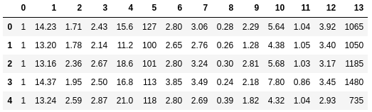
df_wine.head()
Next, we will process the Wine data into separate training and test sets — using a 70:30 split — and standardize it to unit variance:
from sklearn.model_selection import train_test_split
from sklearn.preprocessing import StandardScaler

# split into training and testing sets
X, y = df_wine.iloc[:, 1:].values, df_wine.iloc[:, 0].values
X_train, X_test, y_train, y_test = train_test_split(
    X, y, test_size=0.3,
    stratify=y, random_state=0
)
# standardize the features
sc = StandardScaler()
X_train_std = sc.fit_transform(X_train)
X_test_std = sc.transform(X_test)
After completing the mandatory preprocessing, let’s advance to the second step: constructing the covariance matrix. The symmetric d x d-dimensional covariance matrix, where d is the number of dimensions in the dataset, stores the pairwise covariances between the different features. For example, the covariance between two features xj and xk on the population level can be calculated via the following equation:

Here, μj and μk are the sample means of features j and k, respectively.
Note that the sample means are zero if we standardized the dataset. A positive covariance between two features indicates that the features increase or decrease together, whereas a negative covariance indicates that the features vary in opposite directions. For example, the covariance matrix of three features can then be written as follows (note that Σ stands for the Greek uppercase letter sigma, which is not to be confused with the sum symbol):

The eigenvectors of the covariance matrix represent the principal components (the directions of maximum variance), whereas the corresponding eigenvalues will define their magnitude. In the case of the Wine dataset, we would obtain 13 eigenvectors and eigenvalues from the 13 x 13-dimensional covariance matrix.
Now, for our third step, let’s obtain the eigenpairs of the covariance matrix. An eigenvector v satisfies the following condition:

Here, λ is a scalar: the eigenvalue. Since the manual computation of eigenvectors and eigenvalues is a somewhat tedious and elaborate task, we will use the linalg.eig function from NumPy to obtain the eigenpairs of the Wine covariance matrix:
import numpy as np

cov_mat = np.cov(X_train_std.T)
eigen_vals, eigen_vecs = np.linalg.eig(cov_mat)
Using the numpy.cov function, we computed the covariance matrix of the standardized training dataset. Using the linalg.eig function, we performed the eigendecomposition, which yielded a vector (eigen_vals) consisting of 13 eigenvalues and the corresponding eigenvectors stored as columns in a 13 x 13-dimensional matrix (eigen_vecs).
Total and Explained Variance
Since we want to reduce the dimensionality of our dataset by compressing it onto a new feature subspace, we only select the subset of the eigenvectors (principal components) that contains most of the information (variance). The eigenvalues define the magnitude of the eigenvectors, so we have to sort the eigenvalues by decreasing magnitude; we are interested in the top k eigenvectors based on the values of their corresponding eigenvalues.
But before we collect those k most informative eigenvectors, let’s plot the variance explained ratios of the eigenvalues. The variance explained ratio of an eigenvalue λj is simply the fraction of an eigenvalue λj and the total sum of the eigenvalues:

Using the NumPy cumsum function, we can then calculate the cumulative sum of explained variances, which we will then plot via matplotlib’s step function:
import matplotlib.pyplot as plt

# calculate cumulative sum of explained variances
tot = sum(eigen_vals)
var_exp = [(i / tot) for i in sorted(eigen_vals, reverse=True)]
cum_var_exp = np.cumsum(var_exp)

# plot explained variances
plt.bar(range(1,14), var_exp, alpha=0.5,
        align='center', label='individual explained variance')
plt.step(range(1,14), cum_var_exp, where='mid',
         label='cumulative explained variance')
plt.ylabel('Explained variance ratio')
plt.xlabel('Principal component index')
plt.legend(loc='best')
plt.show()

The resulting plot indicates that the first principal component alone accounts for approximately 40% of the variance. Also, we can see that the first two principal components combined explain almost 60% of the variance in the dataset.
Feature Transformation
After we have successfully decomposed the covariance matrix into eigenpairs, let’s now proceed with the last three steps of PCA to transform the Wine dataset onto the new principal component axes.
We will sort the eigenpairs by descending order of the eigenvalues, construct a projection matrix from the selected eigenvectors, and use the projection matrix to transform the data onto the lower-dimensional subspace.
We start by sorting the eigenpairs by decreasing order of the eigenvalues:
# Make a list of (eigenvalue, eigenvector) tuples
eigen_pairs = [(np.abs(eigen_vals[i]), eigen_vecs[:, i]) for i in range(len(eigen_vals))]

# Sort the (eigenvalue, eigenvector) tuples from high to low
eigen_pairs.sort(key=lambda k: k[0], reverse=True)
Next, we collect the two eigenvectors that correspond to the two largest eigenvalues, to capture about 60% of the variance in this dataset. Note that we only chose two eigenvectors for the purpose of illustration, since we are going to plot the data via a two-dimensional scatter plot later in this subsection. In practice, the number of principal components has to be determined by a trade-off between computational efficiency and the performance of the classifier:
w = np.hstack((eigen_pairs[0][1][:, np.newaxis], eigen_pairs[1][1][:, np.newaxis]))
print('Matrix W:\n', w)
[Out:]
Matrix W:
 [[-0.13724218  0.50303478]
 [ 0.24724326  0.16487119]
 [-0.02545159  0.24456476]
 [ 0.20694508 -0.11352904]
 [-0.15436582  0.28974518]
 [-0.39376952  0.05080104]
 [-0.41735106 -0.02287338]
 [ 0.30572896  0.09048885]
 [-0.30668347  0.00835233]
 [ 0.07554066  0.54977581]
 [-0.32613263 -0.20716433]
 [-0.36861022 -0.24902536]
 [-0.29669651  0.38022942]]
By executing the preceding code, we have created a 13 x 2-dimensional projection matrix W from the top two eigenvectors.
Using the projection matrix, we can now transform a sample x (represented as a 1 x 13-dimensional row vector) onto the PCA subspace (the principal components one and two) obtaining x′, now a two-dimensional sample vector consisting of two new features:

X_train_std[0].dot(w)
Similarly, we can transform the entire 124 x 13-dimensional training dataset onto the two principal components by calculating the matrix dot product:

X_train_pca = X_train_std.dot(w)
Lastly, let’s visualize the transformed Wine training set, now stored as an 124 x 2-dimensional matrix, in a two-dimensional scatterplot:
colors = ['r', 'b', 'g']
markers = ['s', 'x', 'o']
for l, c, m in zip(np.unique(y_train), colors, markers):
    plt.scatter(X_train_pca[y_train==l, 0],
                X_train_pca[y_train==l, 1],
                c=c, label=l, marker=m)
plt.xlabel('PC 1')
plt.ylabel('PC 2')
plt.legend(loc='lower left')
plt.show()

As we can see in the resulting plot, the data is more spread along the x-axis — the first principal component — than the second principal component (y-axis), which is consistent with the explained variance ratio plot that we created previously. However, we can intuitively see that a linear classifier will likely be able to separate the classes well.
Although we encoded the class label information for the purpose of illustration in the preceding scatter plot, we have to keep in mind that PCA is an unsupervised technique that does not use any class label information.
PCA in scikit-learn
Although the verbose approach in the previous subsection helped us to follow the inner workings of PCA, we will now discuss how to use the PCA class implemented in scikit-learn. The PCA class is another one of scikit-learn’s transformer classes, where we first fit the model using the training data before we transform both the training data and the test dataset using the same model parameters.
Let’s use the PCA class on the Wine training dataset, classify the transformed samples via logistic regression:
from sklearn.linear_model import LogisticRegression
from sklearn.decomposition import PCA

# intialize pca and logistic regression model
pca = PCA(n_components=2)
lr = LogisticRegression(multi_class='auto', solver='liblinear')

# fit and transform data
X_train_pca = pca.fit_transform(X_train_std)
X_test_pca = pca.transform(X_test_std)
lr.fit(X_train_pca, y_train)
Now, using a custom plot_decision_regions function, we will visualize the decision regions:
from matplotlib.colors import ListedColormap

def plot_decision_regions(X, y, classifier, resolution=0.02):
    # setup marker generator and color map
    markers = ('s', 'x', 'o', '^', 'v')
    colors = ('red', 'blue', 'lightgreen', 'gray', 'cyan')
    cmap = ListedColormap(colors[:len(np.unique(y))])

    # plot the decision surface
    x1_min, x1_max = X[:, 0].min() - 1, X[:, 0].max() + 1
    x2_min, x2_max = X[:, 1].min() - 1, X[:, 1].max() + 1
    xx1, xx2 = np.meshgrid(np.arange(x1_min, x1_max, resolution),
                           np.arange(x2_min, x2_max, resolution))
    Z = classifier.predict(np.array([xx1.ravel(), xx2.ravel()]).T)
    Z = Z.reshape(xx1.shape)
    plt.contourf(xx1, xx2, Z, alpha=0.4, cmap=cmap)
    plt.xlim(xx1.min(), xx1.max())
    plt.ylim(xx2.min(), xx2.max())

    # plot class samples
    for idx, cl in enumerate(np.unique(y)):
        plt.scatter(x=X[y == cl, 0],
                    y=X[y == cl, 1],
                    alpha=0.6,
                    c=[cmap(idx)],
                    edgecolor='black',
                    marker=markers[idx],
                    label=cl)# plot decision regions for training set


plot_decision_regions(X_train_pca, y_train, classifier=lr)
plt.xlabel('PC 1')
plt.ylabel('PC 2')
plt.legend(loc='lower left')
plt.show()

By executing the preceding code, we should now see the decision regions for the training data reduced to two principal component axes.
For the sake of completeness, let’s plot the decision regions of the logistic regression on the transformed test dataset as well to see if it can separate the classes well:
# plot decision regions for test set
plot_decision_regions(X_test_pca, y_test, classifier=lr)
plt.xlabel('PC1')
plt.ylabel('PC2')
plt.legend(loc='lower left')
plt.show()
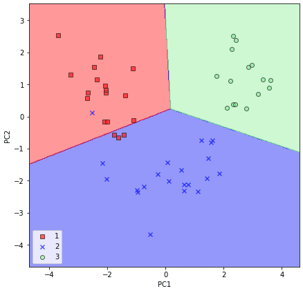
After we plotted the decision regions for the test set by executing the preceding code, we can see that logistic regression performs quite well on this small two-dimensional feature subspace and only misclassifies very few samples in the test dataset.
If we are interested in the explained variance ratios of the different principal components, we can simply initialize the PCA class with the n_components parameter set to None, so all principal components are kept and the explained variance ratio can then be accessed via the explained_variance_ratio_ attribute:
pca = PCA(n_components=None)
X_train_pca = pca.fit_transform(X_train_std)
pca.explained_variance_ratio_
Note that we set n_components=None when we initialized the PCA class so that it will return all principal components in a sorted order instead of performing a dimensionality reduction.
I hope you enjoyed this tutorial on principal component analysis for dimensionality reduction! We covered the mathematics behind the PCA algorithm, how to perform PCA step-by-step with Python, and how to implement PCA using scikit-learn. Other techniques for dimensionality reduction are Linear Discriminant Analysis (LDA) and Kernel PCA (used for non-linearly separable data).
These other techniques and more topics to improve model performance, such as data preprocessing, model evaluation, hyperparameter tuning, and ensemble learning techniques are covered in Next Tech’s Python Machine Learning (Part 2) course.
You can get started here for free!


Top comments (0)