Tutorial: Text Analysis in Python to Test a Hypothesis
People often complain about important subjects being covered too little in the news. One such subject is climate change. The scientific consensus is that this is an important problem, and it stands to reason that the more people are aware of it, the better our chances may be of solving it. But how can we assess how widely covered climate change is by various media outlets? We can use Python to do some text analysis!
Specifically, in this post, we'll try to answer some questions about which news outlets are giving climate change the most coverage. At the same time, we'll learn some of the programming skills required to analyze text data in Python and test a hypothesis related to that data.
This tutorial assumes that you’re fairly familiar with Python and the popular data science package pandas. If you'd like to brush up on pandas, check out this post, and if you need to build a more thorough foundation, Dataquest's data science courses cover all of the Python and pandas fundamentals in more depth.
Finding & Exploring our Data Set
For this post we’ll use a news data set from Kaggle provided by Andrew Thompson (no relation). This data set contains over 142,000 articles from 15 sources mostly from 2016 and 2017, and is split into three different csv files. Here is the article count as displayed on the Kaggle overview page by Andrew:
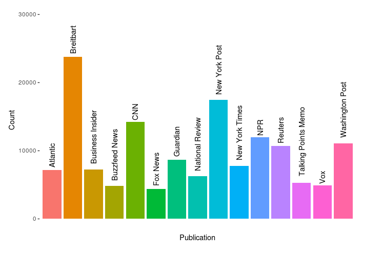
We’ll work on reproducing our own version of this later. But one of the things that might be interesting to look at is the correlation, if any, between the characteristics of these news outlets and the proportion of climate-change-related articles they publish.
Some interesting characteristics we could look at include ownership (independent, non-profit, or corporate) and political leanings, if any. Below, I've done some preliminary research, collecting information from Wikipedia and the providers' own web pages.
I also found two websites that rate publications for their liberal vs conservative bias, allsides.com and mediabiasfactcheck.com, so I've collected some information about political leanings from there.
- Atlantic:
- Owner: Atlantic Media; majority stake recently sold to Emerson collective, a non-profit founded by Powell Jobs, widow of Steve Jobs
- Lean Left
- Breitbart:
- Owner: Breitbart News Network, LLC
- Founded by a conservative commentator
- Right
- Business Insider:
- Owner: Alex Springer SE (publishing house in Europe)
- Center / left-center
- Buzzfeed News:
- Private, Jonah Peretti CEO & Kenneth Lerer, executive chair (latter also co-founder of Huffington Post)
- Lean left
- CNN:
- Turner Broadcasting System, mass media
- TBS itself is owned by Time Warner
- Lean left
- Fox News:
- Fox entertainment group, mass media
- Lean right / right
- Guardian:
- Guardian Media Group (UK), mass media
- Owned by Scott Trust Limited
- Lean left
- National Review:
- National Review Institute, a non-profit
- Founded by William F Buckley Jr
- Right
- New York Post:
- News corp, mass media
- Right / right center
- New York Times:
- NY Times Company
- Lean Left
- NPR:
- Non-profit
- Center / left-center
- Reuters:
- Thomson Reuters Corporation (Canadian multinational mass media)
- Center
- Talking points memo:
- Josh Marshall, independent
- Left
- Washington Post:
- Nash Holdings LLC, controlled by J. Bezos
- Lean left
- Vox:
- Vox Media, multinational
- Lean left / left
Looking this over, we might hypothesize that right-leaning Breitbart, for example, would have a lower proportion of climate related articles than, say, NPR.
We can turn this into a formal hypothesis statement and will do that later in the post. But first, let’s dive deeper into the data. A terminology note: in the computational linguistics and NLP communities, a text collection such as this is called a corpus, so we'll use that terminology here when talking about our text data set.
Exploratory Data Analysis, or EDA, is an important part of any Data Science project. It usually involves analyzing and visualizing the data in various ways to look for patterns before proceeding with more in-depth analysis. In this case, though, we're working with text data rather than numerical data, which makes things a bit different.
For example, in numerical exploratory data analysis, we'd often want to look at the mean values for our data features. But there’s no such thing as an “average” word in a textual database, which makes our task a bit more complex. However, there are still both quantitative and qualitative explorations we can perform to sanity check our corpus’s integrity.
First, let’s reproduce the chart above to ensure that we're not missing any data, and then sort by article count. We'll start by covering all of our imports, reading the data set, and checking the length of each of its three parts.
# set up and load data, checking we've gotten it all
import pandas as pd
import numpy as np
import string
import re
from collections import Counter
from nltk.corpus import stopwords

pt1= pd.read_csv('data/articles1.csv.zip',
compression='zip', index_col=0)

pt1.head()| id | title | publication | author | date | year | month | url | content | |
|---|---|---|---|---|---|---|---|---|---|
| 0 | 17283 | House Republicans Fret About Winning Their Hea... | New York Times | Carl Hulse | 2016-12-31 | 2016.0 | 12.0 | NaN | WASHINGTON — Congressional Republicans have... |
| 1 | 17284 | Rift Between Officers and Residents as Killing... | New York Times | Benjamin Mueller and Al Baker | 2017-06-19 | 2017.0 | 6.0 | NaN | After the bullet shells get counted, the blood... |
| 2 | 17285 | Tyrus Wong, ‘Bambi’ Artist Thwarted by Racial ... | New York Times | Margalit Fox | 2017-01-06 | 2017.0 | 1.0 | NaN | When Walt Disney’s “Bambi” opened in 1942, cri... |
| 3 | 17286 | Among Deaths in 2016, a Heavy Toll in Pop Musi... | New York Times | William McDonald | 2017-04-10 | 2017.0 | 4.0 | NaN | Death may be the great equalizer, but it isn’t... |
| 4 | 17287 | Kim Jong-un Says North Korea Is Preparing to T... | New York Times | Choe Sang-Hun | 2017-01-02 | 2017.0 | 1.0 | NaN | SEOUL, South Korea — North Korea’s leader, ... |
len(pt1)50000pt2 = pd.read_csv('data/articles2.csv.zip',compression='zip',index_col=0)
len(pt2)49999pt3 = pd.read_csv('data/articles3.csv.zip',compression='zip',index_col=0)
len(pt3)42571Working with three separate data sets isn't going to be convenient, though. We'll combine all three DataFrames into a single one so we can work with our entire corpus more easily:
articles = pd.concat([pt1,pt2,pt3])
len(articles)142570Next, we'll make sure we have the same publication names as in the original data set, and check the earliest and latest years of the articles.
articles.publication.unique()array(['New York Times', 'Breitbart', 'CNN', 'Business Insider',
'Atlantic', 'Fox News', 'Talking Points Memo', 'Buzzfeed News',
'National Review', 'New York Post', 'Guardian', 'NPR', 'Reuters',
'Vox', 'Washington Post'], dtype=object)print(articles['year'].min())
articles['year'].max()2000.0
2017.0It’s unusual to store dates as floats like we see above, but that is how they are stored in our CSV file. We're not planning to use dates for anything too important anyway, so for the purposes of this tutorial we'll just leave them as floats. If we were doing a different analysis, though, we might want to convert them to a different format.
Let's take a quick look at when our articles are from using pandas' value_counts() function.
articles['year'].value_counts()2016.0 85405
2017.0 50404
2015.0 3705
2013.0 228
2014.0 125
2012.0 34
2011.0 8
2010.0 6
2009.0 3
2008.0 3
2005.0 2
2004.0 2
2003.0 2
2007.0 1
2000.0 1
Name: year, dtype: int64We can see that there are mostly recent years, but a few older articles are included, too. That serves our purposes fine, as we're mostly concerned with coverage over the past few years.
Now, let's sort the publications by name to reproduce the original plot from Kaggle.
ax = articles['publication'].value_counts().sort_index().plot(kind='bar', fontsize=14, figsize=(12,10))
ax.set_title('Article Count\n', fontsize=20)
ax.set_xlabel('Publication', fontsize=18)
ax.set_ylabel('Count', fontsize=18);
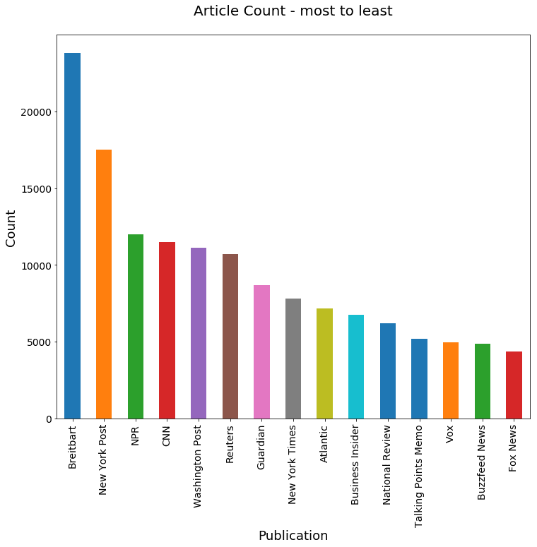
This plot order is helpful if you want to find a specific outlet quickly, but it may be more helpful for us to sort it by article count so that we get a better idea of where our data is coming from.
ax = articles['publication'].value_counts().plot(kind='bar', fontsize=14, figsize=(12,10))
ax.set_title('Article Count - most to least\n', fontsize=20)
ax.set_xlabel('Publication', fontsize=18)
ax.set_ylabel('Count', fontsize=18);
We want to check the average article length in words, but equally important is the diversity of those words. Let’s look at both.
We'll start by defining a function that removes punctuation and converts all the text to lower case. (We’re not doing any complicated syntactic analysis, so we don’t need to preserve the sentence structure or capitalization).
def clean_text(article):
    clean1 = re.sub(r'['+string.punctuation + '’—”'+']', "", article.lower())
    return re.sub(r'\W+', ' ', clean1)
Now we'll create a new column in our dataframe with the cleaned up text.
articles['tokenized'] = articles['content'].map(lambda x: clean_text(x))articles['tokenized'].head()0 washington congressional republicans have a ne...
1 after the bullet shells get counted the blood ...
2 when walt disneys bambi opened in 1942 critics...
3 death may be the great equalizer but it isnt n...
4 seoul south korea north koreas leader kim said...
Name: tokenized, dtype: objectAbove, we can see that we've successfully removed capitalization and punctuation from our corpus, which should make it easier for us to identify and count unique words.
Let's take a look at the average (mean) number of words in each article, and the longest and shortest articles in our data set.
articles['num_wds'] = articles['tokenized'].apply(lambda x: len(x.split()))
articles['num_wds'].mean()732.36012485095046articles['num_wds'].max()
articles['num_wds'].min()49902
0An article with zero words isn't any use to us, so let's see how many of those there are. We'll want to remove articles with no words from our data set.
len(articles[articles['num_wds']==0])97Let's get rid of those empty articles and then see what that does to the mean number of words per article in our data set, and what our new minimum word count is.
articles = articles[articles['num_wds']>0]
articles['num_wds'].mean()
articles['num_wds'].min()
732.85873814687693
1At this point, it might be helpful for us visualize a distribution of the article word counts to see how skewed our average might be by outliers. Let's generate another plot to take a look:
ax=articles['num_wds'].plot(kind='hist', bins=50, fontsize=14, figsize=(12,10))
ax.set_title('Article Length in Words\n', fontsize=20)
ax.set_ylabel('Frequency', fontsize=18)
ax.set_xlabel('Number of Words', fontsize=18);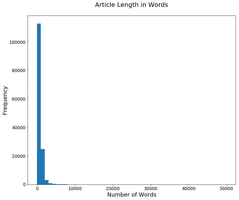
Next step in our Python text analysis: explore article diversity. We’ll use the number of unique words in each article as a start. To calculate that value, we need to create a set out of the words in the article, rather than a list. We can think of a set as being a bit like a list, but a set will omit duplicate entries.
There's more information on sets and how they work in the official documentation, but let's first take a look at a basic example of how creating a set works. Notice that although we start with two b entries, there is only one in the set we create:
set('b ac b'.split()){'ac', 'b'}Next, we're going to do a few things at once:
Operating on the series from the tokenized column that we created earlier, we will invoke the split function from the string library. Then we'll get the set from our series to eliminate duplicate words, then measure the size of the set with len().
Finally, we’ll add the result as a new column that contains the number of unique words in each article.
articles['uniq_wds'] = articles['tokenized'].str.split().apply(lambda x: len(set(x)))
articles['uniq_wds'].head()
0 389
1 1403
2 920
3 1037
4 307
Name: uniq_wds, dtype: int64We also want to take a look at the average (mean) number of unique words per article, and the minimum and maximum unique word counts.
articles['uniq_wds'].mean()
articles['uniq_wds'].min()
articles['uniq_wds'].max()
336.49826282874648
1
4692When we plot this into a chart, we can see that while the distribution of unique words is still skewed, it looks a bit more like a normal (Gaussian) distribution than the distribution based on total word counts we generated earlier.
ax=articles['uniq_wds'].plot(kind='hist', bins=50, fontsize=14, figsize=(12,10))
ax.set_title('Unique Words Per Article\n', fontsize=20)
ax.set_ylabel('Frequency', fontsize=18)
ax.set_xlabel('Number of Unique Words', fontsize=18);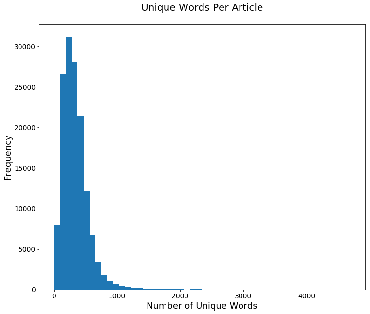
Let’s also look at how these two measures of article length differ by publication.
To do that, we’ll use pandas’s groupby function. The full documentation on this powerful function can be found here, but for our purposes, we just need to know that it allows us to aggregate, or total in different ways, different metrics by the values of another column.
In this case that column is publication. This first plot uses just the number of objects in each group by aggregating over len. We could have used any other column besides title in the code below.
art_grps = articles.groupby('publication')

ax=art_grps['title'].aggregate(len).plot(kind='bar', fontsize=14, figsize=(12,10))
ax.set_title('Articles per Publication (repeated)\n', fontsize=20)
ax.set_ylabel('Number of Articles', fontsize=18)
ax.set_xlabel('Publication', fontsize=18);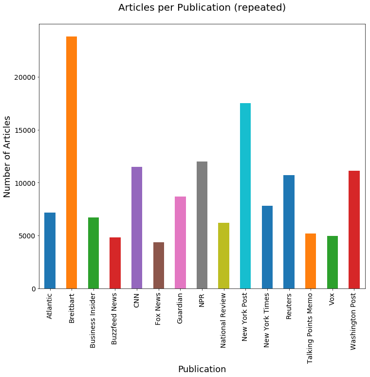
Now we'll aggregate over the mean number of words and number of unique words, respectively.
ax=art_grps['num_wds'].aggregate(np.mean).plot(kind='bar', fontsize=14, figsize=(12,10))
ax.set_title('Mean Number of Words per Article\n', fontsize=20)
ax.set_ylabel('Mean Number of Words', fontsize=18)
ax.set_xlabel('Publication', fontsize=18);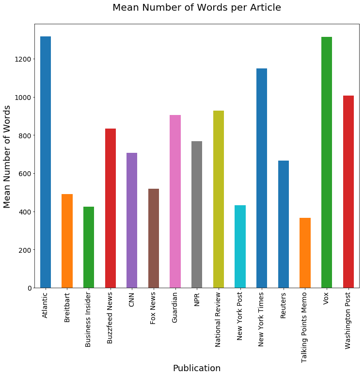
ax=art_grps['uniq_wds'].aggregate(np.mean).plot(kind='bar', fontsize=14, figsize=(12,10))
ax.set_title('Mean Number of Unique Words per Article\n', fontsize=20)
ax.set_ylabel('Mean Number of Unique Words', fontsize=18)
ax.set_xlabel('Publication', fontsize=18);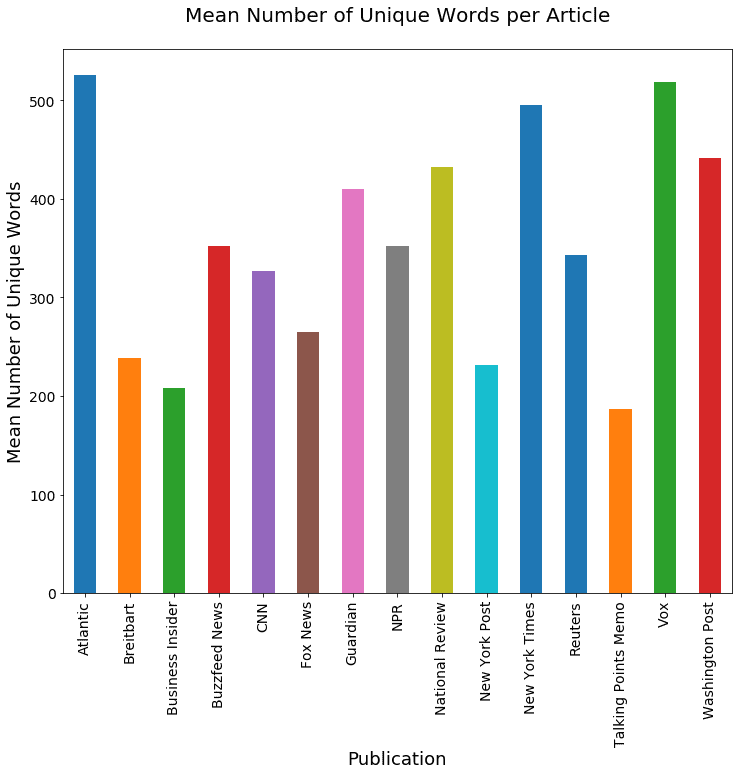
Finally, let’s look at the most common words over the entire corpus.
We'll use a Python Counter, which is a special kind of dictionary that assumes integer types for each key’s value. Here, we iterate through all the articles using the tokenized version of our articles.
wd_counts = Counter()
for i, row in articles.iterrows():
    wd_counts.update(row['tokenized'].split())
When we're counting the most common words, though, we don’t want to include all words in our count. There are a number of words so common in written English that they're likely to appear as the most common words in any analysis. Counting them won't tell us anything about the article's content. In NLP and text processing, these words are called "stopwords." The list of common English stopwords includes words such as “and,” “or,” and “such.”
Remember we imported the module stopwords from nltk.corpus at the beginning of this project, so now let’s take a look at what words are contained in this pre-made stopwords list:
wd_counts = Counter()
for i, row in articles.iterrows():
    wd_counts.update(row['tokenized'].split())
['i',
'me',
'my',
'myself',
'we',
'our',
'ours',
'ourselves',
'you',
"you're",
"you've",
"you'll",
"you'd",
'your',
'yours',
'yourself',
'yourselves',
'he',
'him',
'his',
'himself',
'she',
"she's",
'her',
'hers',
'herself',
'it',
"it's",
'its',
'itself',
'they',
'them',
'their',
'theirs',
'themselves',
'what',
'which',
'who',
'whom',
'this',
'that',
"that'll",
'these',
'those',
'am',
'is',
'are',
'was',
'were',
'be',
'been',
'being',
'have',
'has',
'had',
'having',
'do',
'does',
'did',
'doing',
'a',
'an',
'the',
'and',
'but',
'if',
'or',
'because',
'as',
'until',
'while',
'of',
'at',
'by',
'for',
'with',
'about',
'against',
'between',
'into',
'through',
'during',
'before',
'after',
'above',
'below',
'to',
'from',
'up',
'down',
'in',
'out',
'on',
'off',
'over',
'under',
'again',
'further',
'then',
'once',
'here',
'there',
'when',
'where',
'why',
'how',
'all',
'any',
'both',
'each',
'few',
'more',
'most',
'other',
'some',
'such',
'no',
'nor',
'not',
'only',
'own',
'same',
'so',
'than',
'too',
'very',
's',
't',
'can',
'will',
'just',
'don',
"don't",
'should',
"should've",
'now',
'd',
'll',
'm',
'o',
're',
've',
'y',
'ain',
'aren',
"aren't",
'couldn',
"couldn't",
'didn',
"didn't",
'doesn',
"doesn't",
'hadn',
"hadn't",
'hasn',
"hasn't",
'haven',
"haven't",
'isn',
"isn't",
'ma',
'mightn',
"mightn't",
'mustn',
"mustn't",
'needn',
"needn't",
'shan',
"shan't",
'shouldn',
"shouldn't",
'wasn',
"wasn't",
'weren',
"weren't",
'won',
"won't",
'wouldn',
"wouldn't"]As we can see, this is quite a long list, but none of these words can really tell us anything about the meaning of an article. Let's use this list to delete the stopwords from our Counter.
for sw in stopwords.words('english'):
    del wd_counts[sw]
To further filter our word counts down into useful information, Counter has a handy most_common method which we can use here to take a look at just the most commonly-used words it found. Using this fucntion, we can specify the number of results we'd like to see. Here, we'll ask it for a list of just the top 20 most common words.
wd_counts.most_common(20)[('said', 571476),
('trump', 359436),
('would', 263184),
('one', 260552),
('people', 246748),
('new', 205187),
('also', 181491),
('like', 178532),
('president', 161541),
('time', 144047),
('could', 143626),
('first', 132971),
('years', 131219),
('two', 126745),
('even', 124510),
('says', 123381),
('state', 118926),
('many', 116965),
('u', 116602),
('last', 115748)]Above, we can see some pretty predictable words, but also a bit of a surprise: the word u is apparently among the most common. This may seem strange, but it comes from the fact that acronyms like "U.S." and "U.N." are used frequently in these articles.
That's a bit odd, but remember that at the moment we're just exploring the data. The actual hypothesis we want to test is that climate change coverage might be correlated with certain aspects of a media outlet, like its ownership or political leanings. The existence of u as a word in our corpus isn't likely to affect this analysis at all, so we can leave it as-is.
We could do a lot more cleaning and refining for this data set in other areas as well, but it's probably not necessary. Instead, let's move on to the next step: testing whether our initial hypothesis is correct.
Text Analysis: Testing Our Hypothesis
How can we test our hypothesis? First, we have to determine which articles are talking about climate change, and then we have to compare coverage across types of articles.
How can we tell whether an article is talking about climate change? There are several ways we could do this. We could identify concepts using advanced text analytics techniques such as clustering or topic modeling. But for the purposes of this article, let's keep it simple: let's just identify keywords that might correlate with the topic, and search for them in the articles. Just brainstorming some words and phrases of interest should do the trick.
When we list out these phrases, we have to be a little careful to avoid ambiguous words such as “environment” or “sustainability.” These are potentially related to environmentalism, but they could also be about the political environment or business sustainability. Even "climate" may not be a meaningful keyword unless we can be sure it's closely associated with "change."
What we need to do is create a function to determine whether an article contains words of interest to us. To do this, we're going to use regex, or regular expressions. Regex in Python is covered in more detail in this blog post if you need a refresher. In addition to this Regex, we'll also search for exact matches of several other phrases, defined in the cc_wds parameter.
In looking for mentions of climate change, we have to be a bit careful. We can't use the word "change," because that would eliminate related words like "changing".
So here's how we're going to filter it: we want the string chang followed by the string climate within 1 to 5 words (in regular expressions, \w+ matches one or more word characters, and \W+ matches one or more nonword characters).
We can use | is to represent a logical or, so we can also match the string climate followed by the string chang within 1 to 5 words. The 1 to 5 word part is the part of the regex that will look like this: (?:\w+\W+){1,5}?.
All together, searching for these two strings should help us identify any articles that mention climate change, the changing climate, etc.
def find_cc_wds(content, cc_wds=['climate change','global warming', 'extreme weather', 'greenhouse gas'
                                 'clean energy', 'clean tech', 'renewable energy']
):
    found = False
    for w in cc_wds:
        if w in content:
            found = True
            break

    if not found:
        disj = re.compile(r'(chang\w+\W+(?:\w+\W+){1,5}?climate) | (climate\W+(?:\w+\W+){1,5}?chang)')
        if disj.match(content):
            found = True
    return found
Here's a closer look at how the parts of this function work:
disj = re.compile(r'(chang\w+\W+(?:\w+\W+){1,5}?climate)|(climate\W+(?:\w+\W+){1,5}?chang)')disj.match('climate is changing')<_sre.SRE_Match object; span=(0, 16), match='climate is chang'>disj.match('change in extreme climate')<_sre.SRE_Match object; span=(0, 26), match='change in extreme climate'>disj.match('nothing changing here except the weather')As we can see, this is working as intended — it's matching the real references to climate change, and not being thrown off by the use of the term "change" in other contexts.
Now let's use our function to create a new Boolean field indicating whether we've found relevant words, and then see if there are any mentions of climate change in the first five articles of our data set:
articles['cc_wds'] = articles['tokenized'].apply(find_cc_wds)
articles['cc_wds'].head()
0 False
1 False
2 False
3 False
4 False
Name: cc_wds, dtype: boolThe first five articles in our data set don't contain any mentions of climate change, but we know our function is working as intended from our earlier test, so now we can start to do some analysis of the news coverage.
Returning to our original goal of comparing coverage of climate change topics across sources, we might think of counting the number of climate related articles published by each source and comparing across sources. When we do that, we need to account for the disparity in total article counts, though. A larger total number of climate related articles from one outlet may only be due to a larger number of articles published overall.
What we need to do is count the relative proportion of climate related articles. We can use the sum function on a Boolean field such as cc_wds to count the number of True values, and we divide by the number of articles total articles published to get our proportion.
Let's start by taking a look at the total proportion across all sources to give ourselves a baseline to compare each outlet against:
articles['cc_wds'].sum() / len(articles)0.030826893516666315We see that the proportion of climate coverage over all articles is 3.1%, which is fairly low, but not problematic from a statistical point of view.
Next we want to count the relative proportions for each group. Let’s illustrate how this works by looking at the proportion per publication source. We will again use our groupby object and sum, but this time we want the count of articles per group, which we get from the count function:
art_grps['cc_wds'].sum()publication
Atlantic 366.0
Breitbart 471.0
Business Insider 107.0
Buzzfeed News 128.0
CNN 274.0
Fox News 58.0
Guardian 417.0
NPR 383.0
National Review 245.0
New York Post 124.0
New York Times 339.0
Reuters 573.0
Talking Points Memo 76.0
Vox 394.0
Washington Post 437.0
Name: cc_wds, dtype: float64art_grps.count()| id | title | author | date | year | month | url | content | tokenized | num_wds | uniq_wds | cc_wds | |
|---|---|---|---|---|---|---|---|---|---|---|---|---|
| publication | ||||||||||||
| Atlantic | 7178 | 7178 | 6198 | 7178 | 7178 | 7178 | 0 | 7178 | 7178 | 7178 | 7178 | 7178 |
| Breitbart | 23781 | 23781 | 23781 | 23781 | 23781 | 23781 | 0 | 23781 | 23781 | 23781 | 23781 | 23781 |
| Business Insider | 6695 | 6695 | 4926 | 6695 | 6695 | 6695 | 0 | 6695 | 6695 | 6695 | 6695 | 6695 |
| Buzzfeed News | 4835 | 4835 | 4834 | 4835 | 4835 | 4835 | 4835 | 4835 | 4835 | 4835 | 4835 | 4835 |
| CNN | 11485 | 11485 | 7024 | 11485 | 11485 | 11485 | 0 | 11485 | 11485 | 11485 | 11485 | 11485 |
| Fox News | 4351 | 4351 | 1117 | 4349 | 4349 | 4349 | 4348 | 4351 | 4351 | 4351 | 4351 | 4351 |
| Guardian | 8680 | 8680 | 7249 | 8640 | 8640 | 8640 | 8680 | 8680 | 8680 | 8680 | 8680 | 8680 |
| NPR | 11992 | 11992 | 11654 | 11992 | 11992 | 11992 | 11992 | 11992 | 11992 | 11992 | 11992 | 11992 |
| National Review | 6195 | 6195 | 6195 | 6195 | 6195 | 6195 | 6195 | 6195 | 6195 | 6195 | 6195 | 6195 |
| New York Post | 17493 | 17493 | 17485 | 17493 | 17493 | 17493 | 17493 | 17493 | 17493 | 17493 | 17493 | 17493 |
| New York Times | 7803 | 7803 | 7767 | 7803 | 7803 | 7803 | 0 | 7803 | 7803 | 7803 | 7803 | 7803 |
| Reuters | 10710 | 10709 | 10710 | 10710 | 10710 | 10710 | 10710 | 10710 | 10710 | 10710 | 10710 | 10710 |
| Talking Points Memo | 5214 | 5213 | 1676 | 2615 | 2615 | 2615 | 5214 | 5214 | 5214 | 5214 | 5214 | 5214 |
| Vox | 4947 | 4947 | 4947 | 4947 | 4947 | 4947 | 4947 | 4947 | 4947 | 4947 | 4947 | 4947 |
| Washington Post | 11114 | 11114 | 11077 | 11114 | 11114 | 11114 | 11114 | 11114 | 11114 | 11114 | 11114 | 11114 |
Now, let's break that down into proportions and sort the list so that we can quickly see at a glance which outlets are doing the most coverage of climate change:
proportions = art_grps['cc_wds'].sum() / art_grps['cc_wds'].count()
proportions.sort_values(ascending=True)
proportions
publication
New York Post 0.007089
Fox News 0.013330
Talking Points Memo 0.014576
Business Insider 0.015982
Breitbart 0.019806
CNN 0.023857
Buzzfeed News 0.026474
NPR 0.031938
Washington Post 0.039320
National Review 0.039548
New York Times 0.043445
Guardian 0.048041
Atlantic 0.050989
Reuters 0.053501
Vox 0.079644
Name: cc_wds, dtype: float64The proportion ranges from 0.7% for the New York Post to 8% for Vox. Let's plot this, sorted by publication name, and then again sorted by value.
ax=proportions.plot(kind='bar', fontsize=14, figsize=(12,10))
ax.set_title('Mean Proportion of Climate Change Related Articles per Publication\n', fontsize=20)
ax.set_ylabel('Mean Proportion', fontsize=18)
ax.set_xlabel('Publication', fontsize=18);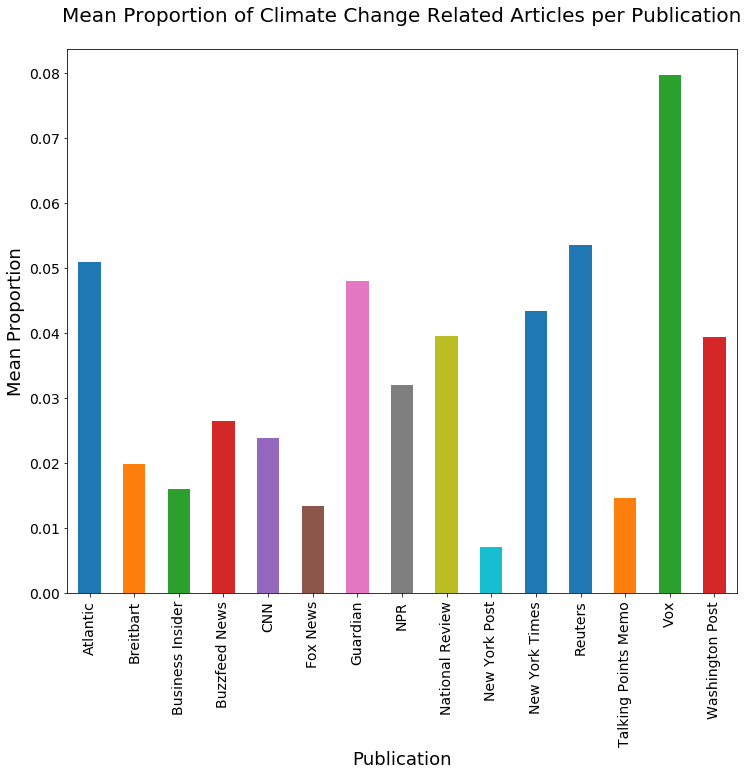
ax=proportions.sort_values(ascending=False).plot(kind='bar', fontsize=14, figsize=(12,10))
ax.set_title('Mean Proportion of Climate Change Related Articles per Publication (Sorted)\n', fontsize=20)
ax.set_ylabel('Mean Proportion', fontsize=18)
ax.set_xlabel('Publication', fontsize=18);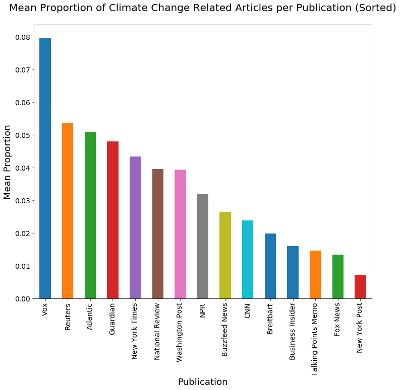
We could do all sorts of other exploratory data analysis here, but let’s put that aside for now and move on to our goal of testing a hypothesis about our corpus.
Testing the Hypothesis
We won’t present a complete overview of hypothesis testing and its subtleties in this post; for an overview of probability in Python visit this article, and for details on statistical hypothesis testing, Wikipedia isn’t a bad place to continue.
We’ll illustrate one form of hypothesis testing here.
Recall that we started off by informally assuming that publication characteristics might correlate with the preponderance of climate related articles they produce. Those characteristics include political leanings and ownership. For example, our null hypothesis related to political leanings informally says that there is no difference in climate change mention when comparing articles with different political leanings. Let’s make that more formal.
If we look at the left vs. right political leanings of the publications, and call the group of publications that lean left “Left” and the right-leaning group “Right,” our null hypothesis is that the population climate change article proportion for Left equals the population climate change article proportion for Right. Our alternative hypothesis is that the two population proportions are unequal. We can substitute other population groupings and state similar hypotheses for other political leaning comparisons or for other publication characteristics.
Let’s start with political leanings. You can revisit the top of this post to remind yourself of how we collected the information about outlets' political leanings. The below code uses a dictionary to assign left, right, and center values to each publication name based on the information we collected.
#liberal, conservative, and center
bias_assigns = {'Atlantic': 'left', 'Breitbart': 'right', 'Business Insider': 'left', 'Buzzfeed News': 'left', 'CNN': 'left', 'Fox News': 'right',
                'Guardian': 'left', 'National Review': 'right', 'New York Post': 'right', 'New York Times': 'left',
                'NPR': 'left', 'Reuters': 'center', 'Talking Points Memo': 'left', 'Washington Post': 'left', 'Vox': 'left'}
articles['bias'] = articles['publication'].apply(lambda x: bias_assigns[x])
articles.head()| id | title | publication | author | date | year | month | url | content | tokenized | num_wds | uniq_wds | cc_wds | bias | |
|---|---|---|---|---|---|---|---|---|---|---|---|---|---|---|
| 0 | 17283 | House Republicans Fret About Winning Their Hea... | New York Times | Carl Hulse | 2016-12-31 | 2016.0 | 12.0 | NaN | WASHINGTON — Congressional Republicans have... | washington congressional republicans have a ne... | 876 | 389 | False | left |
| 1 | 17284 | Rift Between Officers and Residents as Killing... | New York Times | Benjamin Mueller and Al Baker | 2017-06-19 | 2017.0 | 6.0 | NaN | After the bullet shells get counted, the blood... | after the bullet shells get counted the blood ... | 4743 | 1403 | False | left |
| 2 | 17285 | Tyrus Wong, ‘Bambi’ Artist Thwarted by Racial ... | New York Times | Margalit Fox | 2017-01-06 | 2017.0 | 1.0 | NaN | When Walt Disney’s “Bambi” opened in 1942, cri... | when walt disneys bambi opened in 1942 critics... | 2350 | 920 | False | left |
| 3 | 17286 | Among Deaths in 2016, a Heavy Toll in Pop Musi... | New York Times | William McDonald | 2017-04-10 | 2017.0 | 4.0 | NaN | Death may be the great equalizer, but it isn’t... | death may be the great equalizer but it isnt n... | 2104 | 1037 | False | left |
| 4 | 17287 | Kim Jong-un Says North Korea Is Preparing to T... | New York Times | Choe Sang-Hun | 2017-01-02 | 2017.0 | 1.0 | NaN | SEOUL, South Korea — North Korea’s leader, ... | seoul south korea north koreas leader kim said... | 690 | 307 | False | left |
We again use groupby() to find the proportion of climate change articles within each political group.
bias_groups = articles.groupby('bias')
bias_proportions = bias_groups['cc_wds'].sum() / bias_groups['cc_wds'].count()
Let's look at how many articles there are in each group, and chart it:
bias_groups['cc_wds'].count()bias
center 10710
left 79943
right 51820
Name: cc_wds, dtype: int64ax=bias_proportions.plot(kind='bar', fontsize=14, figsize=(12,10))
ax.set_title('Proportion of climate change articles by Political Bias\n', fontsize=20)
ax.set_xlabel('Bias', fontsize=18)
ax.set_ylabel('Proportion', fontsize=18);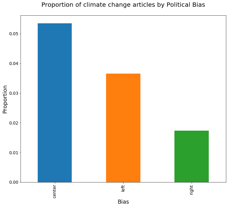
From the above chart, it seems obvious that the proportion of climate change related articles differs for the different political leaning groups, but let's formally test our hypothesis. To do this, for a given pair of article groupings, we state the null hypothesis, which is to assume that there is no difference in the population proportion of climate-related articles. Let’s also establish a 95% confidence level for our test.
Once we gather our statistics, we can use either P-values or confidence intervals to determine whether our results are statistically significant. We’ll use confidence intervals here because we're interested in what range of values of the difference are likely to reflect the population proportion differences. The statistic of interest in our hypothesis test is the difference in the proportion of climate change articles in two samples. Recall that there is a close relationship between confidence intervals and significance tests. Specifically, if a statistic is significantly different than zero at the 0.05 level, then the 95% confidence interval will not contain 0.
In other words, if zero is in the confidence interval that we compute, then we would not reject the null hypothesis. But if it is not, we can say the difference in the proportion of relevant articles is statistically significant. I want to take this opportunity to point out a common misunderstanding in confidence intervals: the 95% interval gives us a region where, had we redone the sampling, then 95% of the time, the interval will contain the true (population) difference in proportion. It is not saying that 95% of the samples will be in the interval.
To compute the confidence interval, we need a point estimate and a margin of error; the latter consists of the critical value multiplied by the standard error. For difference in proportions, our point estimate for the difference is p1 − p2, where p1 and p2 are our two sample proportions. With a 95% CI, 1.96 is our critical value. Next, our standard error is:

Finally, the confidence interval is (point_estimate ± critical_value X standard-error), or:

Let’s plug our numbers into these formulas, using some helper functions to do so.
def standard_err(p1, n1, p2, n2):
    return np.sqrt((p1* (1-p1) / n1) + (p2 * (1-p2) / n2))
def ci_range(diff, std_err, cv=1.96):
return (diff - cv * std_err, diff + cv * std_err)Finally, the calc_ci_range function puts everything together.
def calc_ci_range(p1, n1, p2, n2):
    std_err = standard_err(p1, n1, p2, n2)
    diff = p1-p2
    return ci_range(diff, std_err)
Let's calculate the confidence intervals for our leaning groups, looking first at left vs. right.
center = bias_groups.get_group('center')
left = bias_groups.get_group('left')
right = bias_groups.get_group('right')
calc_ci_range(bias_proportions['left'], len(left), bias_proportions['right'], len(right))(0.017490570656831184, 0.02092806371626154)Looking at the difference in proportions for left vs right publications, our confidence interval ranges from 1.8% to 2.1%. This is both a fairly narrow range and far from zero relative to the overall range of the difference in proportion. So rejecting the null hypothesis is obvious. Similarly, the range for center vs left is 1.3% to 2.1%:
calc_ci_range(bias_proportions['center'], len(center), bias_proportions['left'], len(left))(0.012506913377622272, 0.021418820332295894)Because the assignment of publications to bias slant is somewhat subjective, here is another variant, putting Business Insider, NY Post, and NPR in center.
bias_assigns = {'Atlantic': 'left', 'Breitbart': 'right', 'Business Insider': 'center', 'Buzzfeed News': 'left', 'CNN': 'left', 'Fox News': 'right',
                'Guardian': 'left', 'National Review': 'right', 'New York Post': 'center', 'New York Times': 'left',
                'NPR': 'center', 'Reuters': 'center', 'Talking Points Memo': 'left', 'Washington Post': 'left', 'Vox': 'left'}
articles['bias'] = articles['publication'].apply(lambda x: bias_assigns[x])
bias_groups = articles.groupby('bias')
bias_proportions = bias_groups['cc_wds'].sum() / bias_groups['cc_wds'].count()
ax=bias_proportions.plot(kind='bar', fontsize=14, figsize=(12,10))
ax.set_title('Proportion of climate change articles by Political Bias\n', fontsize=20)
ax.set_xlabel('Bias', fontsize=18)
ax.set_ylabel('Proportion', fontsize=18);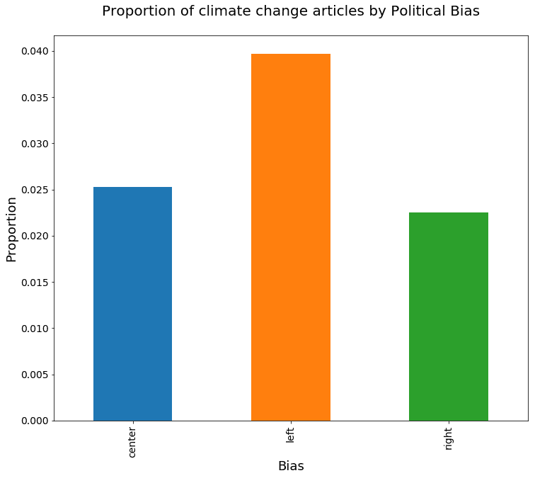
center = bias_groups.get_group('center')
left = bias_groups.get_group('left')
right = bias_groups.get_group('right')
calc_ci_range(bias_proportions['left'], len(left), bias_proportions['right'], len(right))
(0.014934299280171939, 0.019341820093654233)calc_ci_range(bias_proportions['left'], len(left), bias_proportions['center'], len(center))(0.012270972859506818, 0.016471711767773518)calc_ci_range(bias_proportions['center'], len(center), bias_proportions['right'], len(right))(0.0006482405387969359, 0.0048851942077489004)Next, we can look at publication ownership, using the same approach. We divide our population into four groups, LLC, corporation, non-profit, and private.
own_assigns = {'Atlantic': 'non-profit', 'Breitbart': 'LLC', 'Business Insider': 'corp', 'Buzzfeed News': 'private',
               'CNN': 'corp', 'Fox News': 'corp',
                'Guardian': 'LLC', 'National Review': 'non-profit', 'New York Post': 'corp', 'New York Times': 'corp',
                'NPR': 'non-profit', 'Reuters': 'corp', 'Talking Points Memo': 'private', 'Washington Post': 'LLC', 'Vox': 'private'}
articles['ownership'] = articles['publication'].apply(lambda x: own_assigns[x])
owner_groups = articles.groupby('ownership')
owner_proportions = owner_groups['cc_wds'].sum() / owner_groups['cc_wds'].count()
Now let's plot that data to see whether different types of companies cover climate change in different proportions.
ax=owner_proportions.plot(kind='bar', fontsize=14, figsize=(12,10))
ax.set_title('Proportion of climate change articles by Ownership Group\n', fontsize=20)
ax.set_xlabel('Ownership', fontsize=18)
ax.set_ylabel('Proportion', fontsize=18);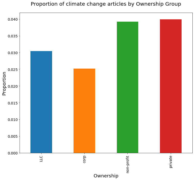
Perhaps unsurprisingly, it looks like private companies and nonprofits cover climate change a bit more than corporations and LLCs. But let's look more closely at the difference in proportion between the first two, LLCs and corporations:
llc = owner_groups.get_group('LLC')
corp = owner_groups.get_group('corp')
non_profit = owner_groups.get_group('non-profit')
private = owner_groups.get_group('private')

calc_ci_range(owner_proportions['LLC'], len(llc), owner_proportions['corp'], len(corp))
(0.0031574852345019415, 0.0072617257208337279)Here, the confidence interval is 0.3% to 0.7%, much closer to zero than our earlier differences, but still not including zero. We would expect the non-profit to LLC interval to also not include zero:
calc_ci_range(owner_proportions['non-profit'], len(non_profit), owner_proportions['LLC'], len(llc))(0.0058992390642172241, 0.011661788182388525)The non-profit to LLC confidence interval is 0.6% to 1.2%.Finally, looking at private vs. non-profit, we find a confidence interval of -0.3% to 0.5%:
calc_ci_range(owner_proportions['private'], len(private), owner_proportions['non-profit'], len(non_profit))(-0.003248922257497777, 0.004627808917174475)Thus in this case, we can conclude that there is not a significant difference in proportion of climate change related articles between these two populations, unlike the others populations we’ve compared.
Summary: Text Analysis to Test a Hypothesis
In this article, we've performed some text analysis on a large corpus of news articles and tested some hypotheses about the differences in their content. Specifically, using a 95% confidence interval, we estimated differences in climate change discussions between different groups of news sources.
We found some interesting differences which were also statistically significant, including that right-leaning news sources tend to cover climate change less, and corporations and LLCs tend to cover it less than non-profit and private outlets.
In terms of working with this corpus, though, we've barely touched the tip of the iceberg. There are many interesting analyses you could attempt with this data, so download the data from Kaggle for yourself and start writing your own text analysis project!
Further Reading:
Olteanu, A, et al. “Comparing events coverage in online news and social media: The case of climate change.” Proceedings of the Ninth International AAAI Conference on Web and Social Media. 2015.
