Recently, I came across to the ggalluvial package in R. This package is particularly used to visualize the categorical data. As usual, I will use it with medical data from NHANES. Ggalluvial is a great choice when visualizing more than two variables within the same plot.
First let's load the libraries we need:
library(tidyverse)
library(RNHANES)
library(ggalluvial)
library(ggsci)
I used the NHANES data from 2009-2010 to see how the diabetes mellitus lies among the overall population in the US. Below, I did data cleaning and wrangling.
dat = nhanes_load_data("DEMO_F", "2009-2010") %>%
  select(SEQN, RIAGENDR, RIDRETH1) %>%
  left_join(nhanes_load_data("DIQ_F", "2009-2010"), by="SEQN") %>%
  select(SEQN, RIAGENDR, RIDRETH1, DIQ010) %>%
  left_join(nhanes_load_data("BMX_F", "2009-2010"), by="SEQN") %>%
  select(SEQN, RIAGENDR, RIDRETH1, DIQ010, BMXBMI) %>%
  mutate(
    gender = recode_factor(RIAGENDR,
                           `1` = "Males",
                           `2` = "Females"),
     race = recode_factor(RIDRETH1,
                         `1` = "Hispanic",
                         `2` = "Hispanic",
                         `3` = "White",
                         `4` = "Black",
                         `5` = "Others"),
    diabetes = recode_factor(DIQ010,
                           `1` = "Yes",
                           `2` = "No"),
    BMI = if_else(BMXBMI >= 25, "Overweight", "Normal weight")) %>%
  filter(!is.na(diabetes), race != "Others", !is.na(BMI))
After having a final dataset 'dat,' I will 'group_by' variables of interest and get the frequency of the combined data. This information will be shown in y-axis of the plot.
dt = dat %>%
  group_by(race, gender, BMI, diabetes) %>%
  summarise(N = n())
Applying the new 'dt' created gives the diagram below:
ggplot(data = dt,
       aes(axis1 = race, axis2 = gender, axis3 = diabetes,
           y = N)) +
  scale_x_discrete(limits = c("race", "gender", "diabetes"), expand = c(.1, .05)) +
  geom_alluvium(aes(fill = BMI)) +
  geom_stratum() + geom_text(stat = "stratum", label.strata = TRUE) +
  theme_minimal() +
  scale_fill_jama() +
  theme(legend.position="bottom") +
  labs( y = "No. individuals", title = "Diabetes in overall population in US 2009-2010",
          subtitle = "stratified by race, gender and diabetes mellitus", caption = "datascienceplus.com")
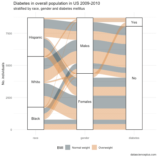
This diagram shows that about 50% of people with diabetes are females, and as expected, most of them are overweight. The contribution of the race to the prevalence of diabetes is equal, so no major race differences are found.
Feel free to comment/suggest.