
For my entire graduate student career, I’ve gravitated toward parallel coordinates plots… in theory. These plots scale well for high-dimensional, multivariate datasets (Figure 1); and therefore, are ideal for visualizing multi-objective optimization solutions. However, I found it difficult to create parallel coordinates plots with the aesthetics and features I wanted.

Figure 1. An example parallel coordinates plot that visualizes the “cars” dataset. Each polyline represents the attributes of a particular car and similar types of cars have the same color polyline.
I was amazed when I learned about Parcoords–a D3-based parallel coordinates library for creating interactive web visualizations. D3 (data-driven documents) is a popular JavaScript library which offers developers total control over their visualizations. Building upon D3, the Parcoords library is capable of creating beautiful, functional, and shareable parallel coordinates visualizations. Bernardo (@bernardoct), David (@davidfgold), and Jan Kwakkel saw the potential of Parcoords, each developing tools (tool #1 and tool #2) and additional features. Exploring these tools, I liked how they linked parallel coordinates plots with interactive data tables using the SlickGrid library. Being able to inspect individual solutions was so powerful. Plus, the features in Parcoords like interactive brushing, reorderable axes, easy-to-read axes labels, blew my mind. Working with large datasets was suddenly intuitive!
The potential of these visualizations was inspiring, but learning web development (i.e., JavaScript, CSS, and HTML) was daunting. Not only would I have to learn web development, I would need to learn how to use multiple libraries, and figure out how to link plots and tables together to make these types of tools. It just seemed like too much work for this sort of visualization to catch on… and that was the inspiration behind Parasol. Together with my advisor (Joe Kasprzyk, @jrk301) and Josh Jacobson, we built Parasol to streamline the development of linked, web-based parallel coordinates visualizations.
We’ve published a paper describing the Parasol library in Environmental Modelling & Software, so please refer to that paper for an in-depth discussion:
Raseman, William J., Joshuah Jacobson, and Joseph R. Kasprzyk. “Parasol: An Open Source, Interactive Parallel Coordinates Library for Multi-Objective Decision Making.” Environmental Modelling & Software 116 (June 1, 2019): 153–63. https://doi.org/10.1016/j.envsoft.2019.03.005.
In this post, I’ll provide a brief, informal overview of Parasol’s features and some example applications.
Cleaning up the clutter with Parasol
Parallel coordinates can visualize large, high-dimensional datasets, but at times they can become difficult to read when polylines overlap and obscure the underlying data. This issue is known as “overplotting” (see Figure 1 and 2a). That’s why we’ve implemented a suite of “clutter reduction techniques” in Parasol that enables the user to tidy up the data dynamically.
Probably the most powerful clutter reduction technique is brushing (Figure 2b). Using interactive filters, the user can filter out unwanted data and focus on a subset of interest. Users can also alter polyline transparency to reveal density in the data (Figure 2c), assign colors to polylines (Figure 2d), and apply “curve bundling” to group similar data together in space (Figure 2e). These clutter reduction techniques can also be used simultaneously to enhance the overall effect (Figure 2f).

Figure 2. Vanilla parallel coordinates plots (a) suffer from “overplotting”, obscuring the underlying data. Interactive filters (b: brushes) and other clutter reduction techniques (c-f) alleviate these issues.
Another cool feature of both Parcoords and Parasol is dynamically reorderable axes (Figure 3). With static plots, the user can only look at pairwise relationships between variables plotted on adjacent axes. With reorderable axes, they are free to explore any pairwise comparison they choose!

Figure 3. Users can click and drag axes to interactively reorder them.
API resources
The techniques described above (and many other features) are implemented using Parasol’s application programming interface (API). In the following examples (Figures 4-6), elements of the API are denoted using ps.XXX(). For a complete list of Parasol features, check out the API Reference on the Parasol GitHub repo.
Example applications
The applications (shown in Figures 4-6) demonstrate the library’s ability to create a range of custom visualization tools. To open the applications, click on the URL in the caption below each image and play around with them for yourself. Parallel coordinates plots are meant to be explored!

Figure 4. Example app #1: https://parasoljs.github.io/demo/paper-example-1.html
Example app #1 (Figure 4) illustrates the use of linked parallel coordinates plots. If the user applies a brush on one plot, the changes will be reflected on both linked plots. Furthermore, app developers can embed functionalities of the Parasol API using HTML buttons. For instance, if the user applies multiple brushes to the plots, they can reset all the brushes by clicking on the “Reset Brushes” button which invokes ps.resetSelections(). Other functionalities allow the user to remove the brushed data from a plot [ps.removeData()] or keep only the brushed data [ps.keepData()] and export brushed data [ps.exportData()].
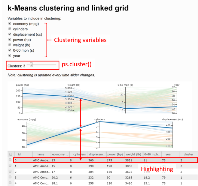
Figure 5. Example app #2: https://parasoljs.github.io/demo/paper-example-2.html
Example app #2 (Figure 5) demonstrates utility of linking data tables to parallel coordinates plots. By hovering a mouse over a data table row, the corresponding polyline will become highlighted. This provides the user with the ability to fine-tune their search and inspect individual data points–a rare feature in parallel coordinates visualizations.
App #2 also demonstrates how k-means clustering [ps.cluster()] can enhance these visualizations by sorting similar data into groups or clusters. In this example, we denote the clusters using color. Using a slider, users can alter the number of clusters (k) in real-time. Using checkboxes, they can customize which variables are included in the clustering calculation.

Figure 6. Example app #3: https://parasoljs.github.io/demo/paper-example-3.html
Example app #3 also incorporates clustering but encodes the clusters using both color and “curve bundling”. With curve bundling, polylines in the same cluster are attracted to one another in the whitespace between the axes. Bundling is controlled by two parameters: 1) curve smoothness and 2) bundling strength. This app allows the user to play around with these parameters using interactive sliders.
Similar to highlighting, Parasol features “marking” to isolate individual data points. Highlighting is temporary, when the user’s mouse leaves the data table, the highlight will disappear. By clicking a checkbox on the data table, the user can “mark” data of interest for later. Although marks are more subtle than highlights, they provide a similar effect.
Lastly, this app demonstrates the weighted sum method [ps.weightedSum()]. Although we don’t generally recommend aggregating objectives in multi-objective optimization literature, there are times when assigning weights to different variables and calculating an aggregate score can be useful. In the above example, the user can input different combinations of weights with text input or using sliders.
We want to hear from you!
For the most up-to-date reference on Parasol, see the GitHub repo, and for additional examples, check out the Parasol webpage. We would love to hear from you, especially if you have suggestions for new features or bugs to report. To do so, post on the issues page for the repo.
If you make a Parasol app and want to share it with the world, post a link in the comments below. It would be great to see what people create!
Parasol tutorials
If you aren’t sure how to start developing Parasol applications, don’t worry. In subsequent posts, I’ll take you step-by-step through how to make some simple apps and give you the tools to move on to more complicated, custom applications.
Those tutorials are currently under development and can be found on the Parasol GitHub wiki.

Pingback: Parasol Resources – Water Programming: A Collaborative Research Blog