This is the third part of our post series about the exploratory analysis of a publicly available dataset reporting earthquakes and similar events within a specific 30 days time span. In this post, we are going to show static, interactive and animated earthquakes maps of different flavors by using the functionalities provided by a pool of R packages as specifically explained herein below.
For static maps:
- ggplot2 package
- tmap package
- ggmap package
For interactive maps:
- leaflet package
- tmap package
- mapview package
For animated maps:
- animation package
- gganimate package
- tmap package
Packages
I am going to take advantage of the following packages.
suppressPackageStartupMessages(library(ggplot2))
suppressPackageStartupMessages(library(ggmap))
suppressPackageStartupMessages(library(ggsn))
suppressPackageStartupMessages(library(dplyr))
suppressPackageStartupMessages(library(lubridate))
suppressPackageStartupMessages(library(sf))
suppressPackageStartupMessages(library(spData))
suppressPackageStartupMessages(library(tmap))
suppressPackageStartupMessages(library(leaflet))
suppressPackageStartupMessages(library(mapview))
suppressPackageStartupMessages(library(animation))
suppressPackageStartupMessages(library(gganimate))
suppressPackageStartupMessages(library(ggthemes))
suppressPackageStartupMessages(library(gifski))
suppressPackageStartupMessages(library(av))
Packages versions are herein listed.
packages <- c("ggplot2", "ggmap", "ggsn", "dplyr", "lubridate", "sf", "spData", "tmap", "leaflet", "mapview", "animation", "gganimate", "ggthemes", "gifski", "av")
version <- lapply(packages, packageVersion)
version_c <- do.call(c, version)
data.frame(packages=packages, version = as.character(version_c))
##     packages version
## 1    ggplot2   3.1.0
## 2      ggmap   3.0.0
## 3       ggsn   0.5.0
## 4      dplyr 0.8.0.1
## 5  lubridate   1.7.4
## 6         sf   0.7.3
## 7     spData   0.3.0
## 8       tmap     2.2
## 9    leaflet   2.0.2
## 10   mapview   2.6.3
## 11 animation     2.6
## 12 gganimate   1.0.2
## 13  ggthemes   4.1.0
## 14    gifski   0.8.6
## 15        av     0.2
Running on Windows-10 the following R language version.
R.version
##                _
## platform       x86_64-w64-mingw32
## arch           x86_64
## os             mingw32
## system         x86_64, mingw32
## status
## major          3
## minor          5.2
## year           2018
## month          12
## day            20
## svn rev        75870
## language       R
## version.string R version 3.5.2 (2018-12-20)
## nickname       Eggshell Igloo
Getting Data
As shown in the previous posts, we download the earthquake dataset from earthquake.usgs.gov, specifically the last 30 days dataset. Please note that such earthquake dataset is day by day updated to cover the last 30 days of data collection. Moreover, it is not the most recent dataset available as I collected it some weeks ago. The earthquakes dataset is in CSV format. If not yet present into our workspace, we download and save it. Then we load it into quakes local variable. .
if ("all_week.csv" %in% dir(".") == FALSE) {
  url <- "https://earthquake.usgs.gov/earthquakes/feed/v1.0/summary/all_week.csv"
  download.file(url = url, destfile = "all_week.csv")
}
quakes <- read.csv("all_month.csv", header=TRUE, sep=',', stringsAsFactors = FALSE)

quakes$time <- ymd_hms(quakes$time)
quakes$updated <- ymd_hms(quakes$updated)

quakes$magType <- as.factor(quakes$magType)
quakes$net <- as.factor(quakes$net)
quakes$type <- as.factor(quakes$type)
quakes$status <- as.factor(quakes$status)
quakes$locationSource <- as.factor(quakes$locationSource)
quakes$magSource <- as.factor(quakes$magSource)
quakes <- arrange(quakes, -row_number())

# earthquakes dataset
earthquakes <- quakes %>% filter(type == "earthquake")
Static Maps
We herein show three flavors of maps by taking advantage of the functionalities provided within the packages ggplot2, tmap and ggmap.
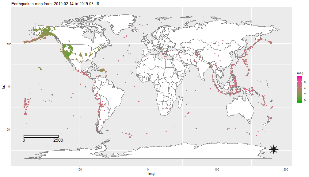
gplot2 package
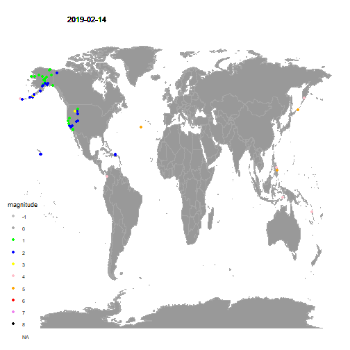
Taking advantage of the ggplot2 package, we create a static map of the earthquake events. Here is the description of the steps to create such a map, numbering corresponds to the comments within the source code.
- we get the “world” data frame providing with data of world regions in a suitable way for plotting
- we set the title string of our map as based on the timeline start and end of our earthquakes dataset
- we create a ggplot object based on the geom_map() geometry in order to obtain polygons from a reference map
- we add to our ggplot object the points graphic objects (by geom_point()) as located where the earthquakes happened
- we add the title
- we add the compass as located to the bottom right of the map, adjusting further its location by the anchor parameter
- we add the scale bar as located to the bottom left, in km units and 2500 km minimum distance represented with WGS84 ellipsoid model
#1
world <- map_data('world')
#2
title <- paste("Earthquakes map from ", paste(as.Date(earthquakes$time[1]), as.Date(earthquakes$time[nrow(earthquakes)]), sep = " to "))
#3
p <- ggplot() + geom_map(data = world, map = world, aes(x = long, y=lat, group=group, map_id=region), fill="white", colour="#7f7f7f", size=0.5)
#4
p <- p + geom_point(data = earthquakes, aes(x=longitude, y = latitude, colour = mag)) + scale_colour_gradient(low = "#00AA00",high = "#FF00AA")
#5
p <- p + ggtitle(title)
#6
p <- p + ggsn::north(data = earthquakes, location = "bottomright", anchor = c("x"=200, "y"=-80), symbol = 15)
#7
p <- p + ggsn::scalebar(data=earthquakes, location = "bottomleft", dist = 2500, dist_unit = "km", transform = TRUE, model = "WGS84")
p
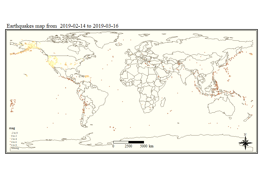
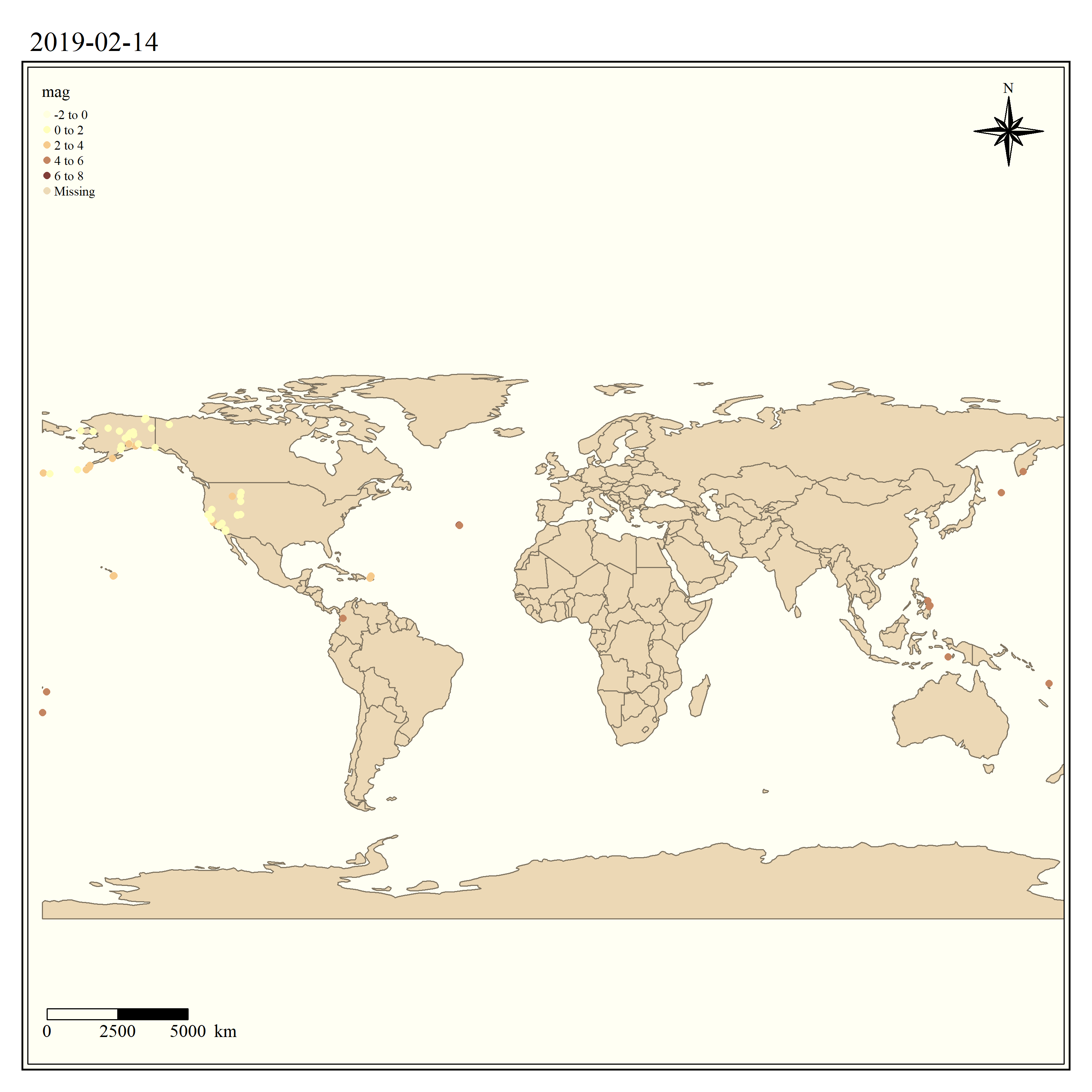
tmap package
In this example, we take advantage of the tmap package. For the purpose, we instantiate a Simple Features object by taking advantage of the sf package. The Simple Features is an open standard developed and endorsed by the Open Geospatial Consortium (OGC), a not-for-profit organization. Simple Features is a hierarchical data model that represents a wide range of geometry types.
Here is the description of the steps to create such a map, numbering corresponds to the comments within the source code.
- we set the WGS84 as a string projection that will be passed as input paramter to the function which will build our spatial object
- we set the title string
- we convert our earthquake dataset to a sf (simple features) object by st_as_sf() function within the sf package
- we create a tmap-element as based on the world Simple Features object as available within the spData package.
- we choose the classic style for out map and white colors with borders for regions
- we add the title
- we add the compass chossing the 8star type in the right+bottom position
- we add a scale bar 0-2500-5000 km in the left+bottom position
- we add the previously build Simple Features object at step #3
- we use the dot symbol to indicate earthquake events on the map with a color scale associated to the magnitude of the event
#1
projcrs <- "+proj=longlat +datum=WGS84 +no_defs +ellps=WGS84 +towgs84=0,0,0"
#2
title <- paste("Earthquakes map from ", paste(as.Date(earthquakes$time[1]), as.Date(earthquakes$time[nrow(earthquakes)]), sep = " to "))
#3
df <- st_as_sf(x = earthquakes, coords = c("longitude", "latitude"), crs = projcrs)
#4
p <- tm_shape(spData::world)
#5
p <- p + tm_style("classic") + tm_fill(col = "white")  + tm_borders()
#6
p <- p + tm_layout(main.title = title)
#7
p <- p + tm_compass(type = "8star", position = c("right", "bottom"))
#8
p <- p + tm_scale_bar(breaks = c(0, 2500, 5000), size = 1, position = c("left", "bottom"))
#9
p <- p + tm_shape(df)
#10
p <- p + tm_dots(size = 0.1, col = "mag", palette = "YlOrRd")
p
## Scale bar set for latitude km and will be different at the top and bottom of the map.
Before introducing further map flavors, we take some time to show an overview of how the typical problem of creating a map for a specific region and related data can be fulfilled. Specifically, let us suppose we would like to draw the California map showing earthquakes occurred on such a geographical region. The quick&dirty approach could be to find out interval ranges for longitude and latitude in order to determine a rectangular geographical region which contains the California boundaries. Something depicted in the source code herein below whose steps are so described.
- we obtain a new dataset starting from the earthquakes one by filtering on specific longitude and latitude intervals
- we get the California map by filtering the California state map from the United States map made available by the spData package
- we convert our california dataset to a sf (simple features) object by st_as_sf() function within the sf package
- we create a tmap-element as based on California map; such tmap-element instance specifies a spatial data object using the world Simple Features object as available within the spData package.
- we choose the classic style for out map and pale green color fill color with borders for regions
- we set the title onto the map
- we add the compass chossing the 8star type in the right+top position
- we add a scale bar 0-100-200 km in the left+bottom position
- we add the previously build Simple Features object as based on the earthquake dataset
- we use the dot symbol to indicate earthquake events on the map with a color scale associated with the magnitude of the event
#1
california_data <- earthquakes %>% filter(longitude >= -125 & longitude <= -114 & latitude <= 42.5 & latitude >= 32.5)
#2
map_california <- us_states %>% filter(NAME == "California")
#3
df <- st_as_sf(x = california_data, coords = c("longitude", "latitude"), crs = st_crs(map_california))
#4
p <- tm_shape(map_california)
#5
p <- p + tm_style("classic") + tm_fill(col = "palegreen4") + tm_borders()
#6
p <- p + tm_layout(main.title = paste("California earthquakes map from ", paste(as.Date(california_data$time[1]), as.Date(california_data$time[nrow(california_data)]), sep = " to ")))
#7
p <- p + tm_compass(type = "8star", position = c("right", "top"))
#8
p <- p + tm_scale_bar(breaks = c(0, 100, 200), size = 1, position = c("left", "bottom"))
#9
p <- p + tm_shape(df)
#10
p <- p + tm_dots(size = 0.1, col = "mag", palette = "YlOrRd")
p

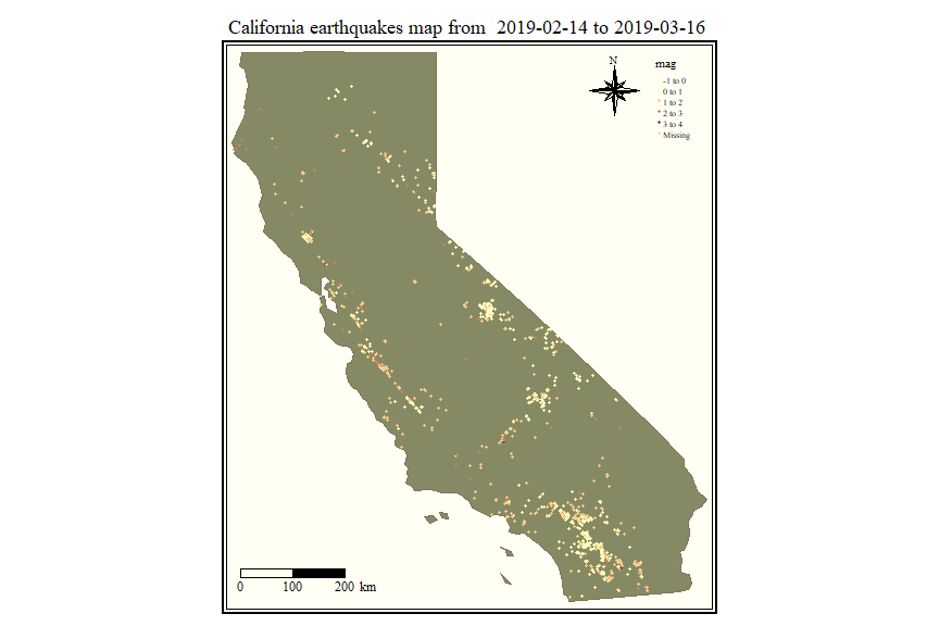
A better result can be achieved by first doing an inner join between our earthquake dataset and the map of California so to determine exactly what are the earthquakes within the California boundaries. Here are the steps to do it.
- we convert our earthquakes dataset to a sf (simple features) object by st_as_sf() function within the sf package
- we inner join (left = FALSE) our simple features object with the California map; that gives a new simple features object providing with earthquakes occurred exactly within California geographical boundaries
- we create a tmap-element as based on California map; such tmap-element instance specifies a spatial data object using the world Simple Features object as available within the spData package.
- we choose the classic style for out map and pale green color fill color with borders for regions
- we set the title onto the map
- we add the compass chossing the 8star type in the right+top position
- we add a scale bar 0-100-200 km in the left+bottom position
- we add the previously build Simple Features object resulting from the inner join at step #2
- we use the dot symbol to indicate earthquake events on the map with a color scale associated with the magnitude of the event
#1
df <- st_as_sf(x = earthquakes, coords = c("longitude", "latitude"), crs = st_crs(map_california))

#2
df_map_inner_join <- st_join(df, map_california, left=FALSE)
## although coordinates are longitude/latitude, st_intersects assumes that they are planar
#3
p <- tm_shape(map_california)
#4
p <- p + tm_style("classic") + tm_fill(col = "palegreen4") + tm_borders()
#5
p <- p + tm_layout(main.title = paste("California earthquakes map from ", paste(as.Date(california_data$time[1]), as.Date(california_data$time[nrow(california_data)]), sep = " to ")))
#6
p <- p + tm_compass(type = "8star", position = c("right", "top"))
#7
p <- p + tm_scale_bar(breaks = c(0, 100, 200), size = 1, position = c("left", "bottom"))
#8
p <- p + tm_shape(df_map_inner_join)
#9
p <- p + tm_dots(size = 0.1, col = "mag", palette = "YlOrRd")
p
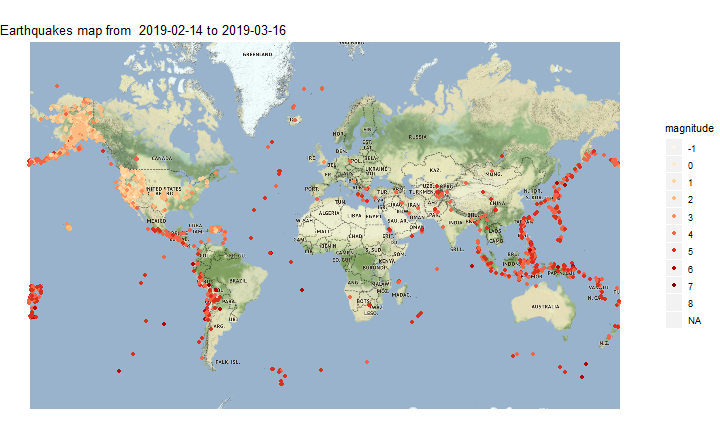
ggmap package
We show a static map as obtained by taking advantage of the qmplot() function within the ggmap package.
So, we draw a map where symbols highlighting magnitude (color) and different point symbols associated to the event type. The qmplot() function is the “ggmap” equivalent to the ggplot2 package function qplot() and allows for the quick plotting of maps with data. The stamen map flavor is used.
title <- paste("Earthquakes map from ", paste(as.Date(earthquakes$time[1]), as.Date(earthquakes$time[nrow(earthquakes)]), sep = " to "))

magnitude <- factor(round(earthquakes$mag))

suppressMessages(qmplot(x = longitude, y = latitude, data = earthquakes, geom = "point", colour = magnitude, source = "stamen", zoom = 3) + scale_color_brewer(palette = 8) + ggtitle(title))
Interactive Maps
An interactive map offers result which depends upon the mouse click actions on the map itself. For example, showing a pop-up with some data when the user clicks on the specific symbol to indicate the location of the earthquake event for our scenario. Unfortunately, the interaction with the map cannot result when embedding it into DS+ site posts, you have to try it out by yourself taking advantage of the following source code. This is true for all the examples we are going to show.
leaflet package
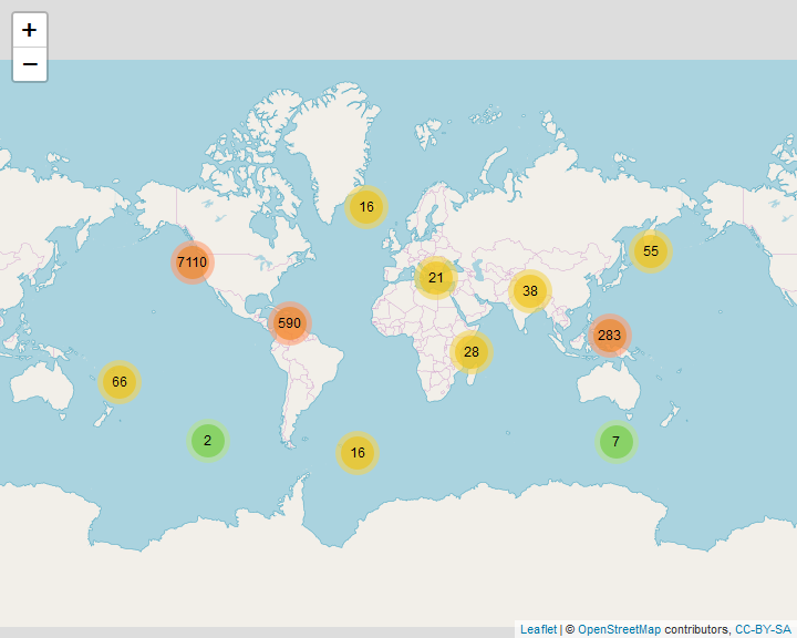
The leaflet package provides with functionalities to create and customize interactive maps using the Leaflet JavaScript library and the htmlwidgets package. These maps can be used directly from the R console, from 'RStudio', in Shiny applications and R Markdown documents. Here is an example where a pop-up is defined to provide with the place, identifier, time, magnitude and depth data. Further, the cluster options eases the user experience by means of a hierarchical representation in terms of clusters that incrementally show up. Here is what we can get.
earthquakes %>% leaflet() %>% addTiles() %>%
  addMarkers(~longitude, ~latitude,
             popup = (paste("Place: ", earthquakes$place, "<br>",
                            "Id: ", earthquakes$id, "<br>",
                            "Time: ", earthquakes$time, "<br>",
                            "Magnitude: ", earthquakes$mag, " m <br>",
                            "Depth: ", earthquakes$depth)),
             clusterOptions = markerClusterOptions())
tmap package
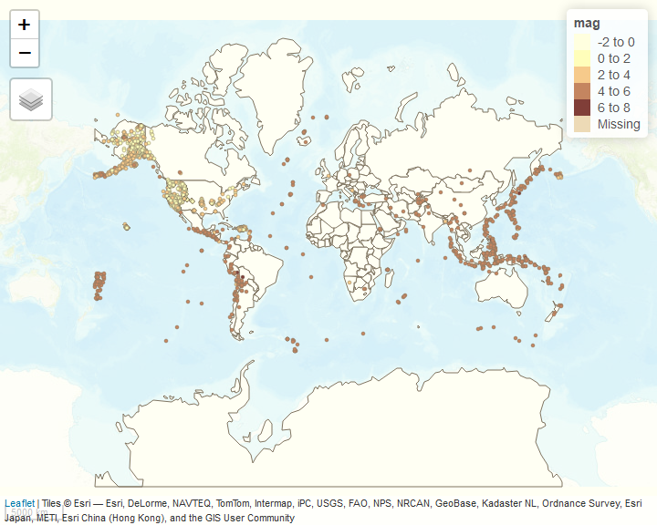
We take advantage of the tmap package again, however this time for an interactive map which can be easily created based previously shown source code for the same package when the tmap mode view is set. Here are the steps to generate such map.
- we set the WGS84 as a string projection that will be passed as input paramter to the function which will build our spatial object
- we set the title string
- we convert our starting earthquake dataset to a sf (simple features) object by st_as_sf() function within the sf package
- we set the tmap_mode equal to “view” to allow for animation (the default is “plot”)
- we create a tmap-element as based on the world Simple Features object as available within the spData package.
- we choose the classic style for out map and white colors with borders for regions
- we add the title
- since the compass is not supported in view mode, we comment such line of code previously used for static maps
- we add a scale bar 0-2500-5000 km in the left+bottom position
- we add the previously build Simple Features object at step #3
- we use the dot symbol to indicate earthquake events on the map with a color scale associated with the magnitude of the event
#1
projcrs <- "+proj=longlat +datum=WGS84 +no_defs +ellps=WGS84 +towgs84=0,0,0"
#2
title <- paste("Earthquakes map from ", paste(as.Date(earthquakes$time[1]), as.Date(earthquakes$time[nrow(earthquakes)]), sep = " to "))
#3
df <- st_as_sf(x = earthquakes, coords = c("longitude", "latitude"), crs = projcrs)
#4
tmap_mode("view")
## tmap mode set to interactive viewing
#5
p <- tm_shape(spData::world)
#6
p <- p + tm_style("classic") + tm_fill(col = "white")  + tm_borders()
#7
p <- p + tm_layout(main.title = title)
#8 compass is not supported in view mode
#p <- p + tm_compass(type = "8star", position = c("right", "bottom"))
#9
p <- p + tm_scale_bar(breaks = c(0, 2500, 5000), size = 1, position = c("left", "bottom"))
#10
p <- p + tm_shape(df)
#11
p <- p + tm_dots(size = 0.01, col = "mag", palette = "YlOrRd")
p
We set the mode to “plot” so to revert back to the static map flavor.
tmap_mode("plot")
## tmap mode set to plotting
mapview package
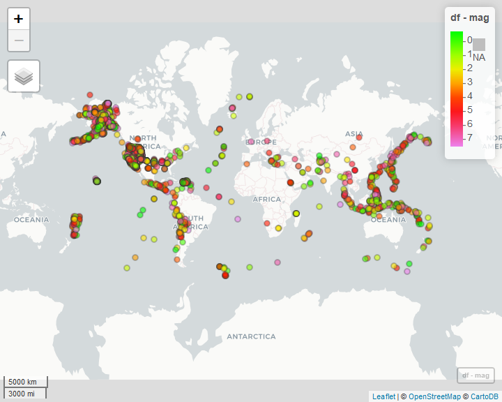
We show an interactive map as obtained by taking advantage of the mapview package. Here are the steps.
- we set the WGS84 as a string projection that will be passed as input parameter to the function which will build our spatial object
- we set the title string
- we convert our starting earthquake dataset to a sf (simple features) object by st_as_sf() function within the sf package
- we create a palette by using the colorRampPalette, a function that gives a fixed number of colors to interpolate the resulting palette with
- we create the interactive map of CartoDB.Positron flavor with popups showing place and magnitude; we control the size of the dot by the cex parameter; we choose to interpolate on 12 colors scale starting from the palette created at step #4
#1
projcrs <- "+proj=longlat +datum=WGS84 +no_defs +ellps=WGS84 +towgs84=0,0,0"
#2
title <- paste("Earthquakes map from ", paste(earthquakes$time[1], earthquakes$time[nrow(earthquakes)], sep = " to "))
#3
df <- st_as_sf(x = earthquakes, coords = c("longitude", "latitude"), crs = projcrs)
#4
pal <- colorRampPalette(c("green", "yellow", "red", "violet"))
#5
mapview(df, popup = popupTable(df, zcol = c("place", "mag")), zcol = "mag", legend = TRUE, map.types = c("CartoDB.Positron"), cex= 4, alpha = 0.3, col.regions = pal(12))
As map flavor, you can choose among CartoDB.Positron, CartoDB.DarkMatter, OpenStreetMap, Esri.WorldImagery, OpenTopoMap.
Animated Maps
We would like to create an animated map showing day by day the location of the events. We then show different implementations for achieving such a goal.
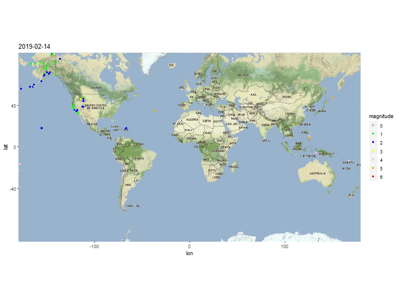
animation package
We herein show how to create an animated GIF by means of the animation package. Also the option to generate a short video in “avi” the format is outlined. Here are the steps to do it.
- we determine the days’ array to be displayed on the map
- we determine how many picture generate, which is equal to the days timespan
- we define a custom color vector of colors name strings
- we determine the box area to be used for map display; that is useful for avoiding an annoying map resizing effect from frame to frame during the resulting animation
- we get the map of stamen flavor and terrain type
- we save the GIF resulting from a loop of maps plot where:
- we get the earthquake day
- we filter the earthquake dataset to find the events associated to the day of step 6.1
- we translate the earthquake magnitude to a new factor variable
- we create the map by ggmap()
- we use point geometries to highlight where the earthquake happened
- we use a color scale custom defined as based on the colors vector defined at step #3
- we add the map title
- we plot the resulting map
- we set as animation options:
– time interval of the animation to 1
– maximum number of steps for each loop equal to 1
– map width and heigth both equal to 1000 pixels
– resulting animated GIF file name
#1
days <- unique(as.Date(earthquakes$time))
#2
l <- length(days)
#3
cols <- c( "-1" = "grey", "0" = "darkgrey", "1" = "green", "2" = "blue", "3" = "yellow", "4" = "pink", "5" = "orange", "6" = "red", "7" = "violet", "8" = "black", "NA" = "white")
#4
bbox <- make_bbox(lon = c(-180, 180), lat = c(-70,70), f = 0)
#5
map <- get_map(location = bbox, zoom = 3, source = "stamen", maptype = "terrain", force = FALSE)
#6
saveGIF( {
  for (i in 1:l) {
    #6.1
    the_day <- days[i]
    #6.2
    earthquakes_of_day <- earthquakes %>% filter(as.Date(time) == the_day)
    #6.3
    magnitude <- factor(round(earthquakes_of_day$mag))
    #6.4
    p <- ggmap(map)
    #6.5
    p <- p + geom_point(data = earthquakes_of_day, aes(x=longitude, y=latitude, color = magnitude))
    #6.6
    p <- p + scale_colour_manual(values = cols)
    #6.7
    p <- p + ggtitle(the_day)
    #6.8
    plot(p)
  }
   #6.9
}, interval = 1, nmax = l, ani.width = 1000, ani.height = 1000, movie.name = "earthquakes1.gif")
Please click on the picture below to see its animation
gganimate package
Another way to create an animated GIF, is to leverage on the animate() function of the gganimate package. Here are the steps to do it.
- we determine the days’ array to be displayed on the map
- we determine the number of frames to be generated for our video, as equal to the number of days our dataset reports
- we determine the days array to be displayed on the map
- we translate the earthquake magnitude to a new factor variable
- we define a custom color vector of colors name strings
- we first create the world map showing regions with borders and fill gray colors
- we highlight the earthquake events on the map by means of point geometry with point colors based on the magnitude; the cumulative flag allows for building up an object or path over time
- we set our custom color scale as defined at step #5
- we add a label showing the day associated to the currently displayed frame within the resulting animation
- we define the frame-to-frame transition variable as the earthquake event day
- we set the fade effect to be applied to the frame visualization sequence
- we set the animation options specifying the image size in pixel units
- we generate the animation specifying its frames length equal to the number of days and the resulting animated GIF file name
#1
days <- unique(as.Date(earthquakes$time))
#2
l <- length(days)
#3
earthquakes$date <- as.Date(earthquakes$time)
#4
magnitude <- factor(round(earthquakes$mag))
#5
cols <- c( "-1" = "grey", "0" = "darkgrey", "1" = "green", "2" = "blue", "3" = "yellow", "4" = "pink", "5" = "orange", "6" = "red", "7" = "violet", "8" = "black", "NA" = "white")
#6
map <- ggplot() + borders("world", colour = "gray65", fill = "gray60") + theme_map()
#7
map <- map + geom_point(aes(x = longitude, y = latitude, colour = magnitude, frame = date, cumulative = TRUE), data = earthquakes)
#8
map <- map + scale_colour_manual(values = cols)
#9
map <- map + geom_text(data = earthquakes, aes(-100, 100, label=date))
#10
map <- map + transition_time(date)
#11
map <- map + enter_fade() + exit_fade()
#12
options(gganimate.dev_args = list(width = 1000, height = 600))
#13
suppressMessages(animate(map, nframes = l, duration = l, renderer = gifski_renderer("earthquakes2.gif")))
##
Frame 1 (3%)
Frame 2 (6%)
Frame 3 (9%)
Frame 4 (12%)
Frame 5 (16%)
Frame 6 (19%)
Frame 7 (22%)
Frame 8 (25%)
Frame 9 (29%)
Frame 10 (32%)
Frame 11 (35%)
Frame 12 (38%)
Frame 13 (41%)
Frame 14 (45%)
Frame 15 (48%)
Frame 16 (51%)
Frame 17 (54%)
Frame 18 (58%)
Frame 19 (61%)
Frame 20 (64%)
Frame 21 (67%)
Frame 22 (70%)
Frame 23 (74%)
Frame 24 (77%)
Frame 25 (80%)
Frame 26 (83%)
Frame 27 (87%)
Frame 28 (90%)
Frame 29 (93%)
Frame 30 (96%)
Frame 31 (100%)
## Finalizing encoding... done!
Please click on the picture below to see its animation
If you like to produce your animation in avi format, change the renderer as herein shown.
animate(map, nframes= 31, duration = 31, renderer = av_renderer("earthquakes2.avi"))
tmap package
The tmap package provides with the function tmap_animation() to create animated maps. Here are the steps to do it.
- we create a new column data named as date inside our earthquake dataset
- we convert our starting earthquake dataset to a sf (simple features) object by st_as_sf() function within the sf package
- we create a tmap-element as based on the world Simple Features object as available within the spData package.
- we choose the classic style for out map and the gray fill color with borders for regions
- we add the compass chossing the 8star type in the right+bottom position
- we add a scale bar 0-2500-5000 km in the left+bottom position
- we add the previously build Simple Features object at step #3
- we use the dot symbol to indicate earthquake events on the map with a color scale associated with the magnitude of the event
- we define facets as based on the earthquake event date
- we save the result in a variable to be used later
#1
earthquakes$date <- as.Date(earthquakes$time)
#2
df <- st_as_sf(x = earthquakes, coords = c("longitude", "latitude"), crs=st_crs(spData::world))
#3
p <- tm_shape(spData::world)
#4
p <- p + tm_style("classic") + tm_fill(col = "gray") + tm_borders()
#5
p <- p + tm_compass(type = "8star", position = c("right", "top"))
#6
p <- p + tm_scale_bar(breaks = c(0, 2500, 5000), size = 1, position = c("left", "bottom"))
#7
p <- p + tm_shape(df)
#8
p <- p + tm_dots(size=0.2, col="mag", palette = "YlOrRd")
#9
p <- p + tm_facets(along = "date", free.coords = TRUE)
#10
maps_result_for_anim <- p
Finally, the animated map is produced by means of the tmap_animation() function.
tmap_animation(maps_result_for_anim, filename = "earthquakes3.gif", delay = 100)
Please click on the picture below to see its animation
If you like to read more about maps visualization with R, take a look at the references list below.
If you have any questions, please feel free to comment below.